At-a-glance
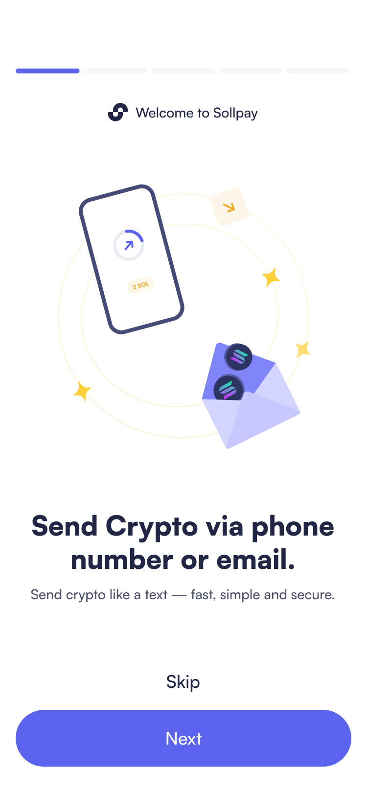
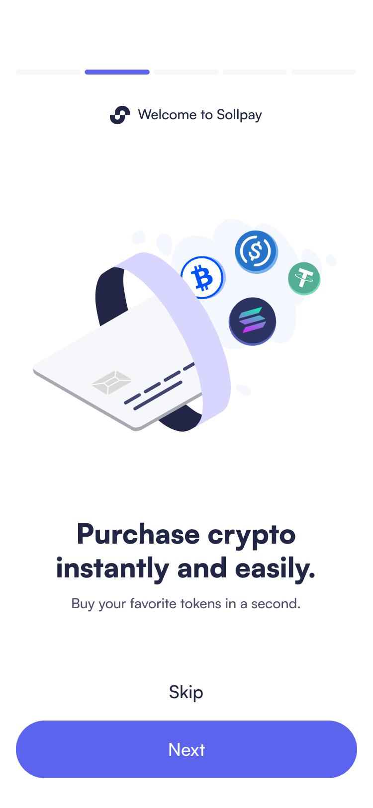
SollPay is a crypto wallet that lets you send money as easily as texting a friend. I designed a complete product from scratch by transforming a powerful but complex crypto technology into an interface that beginners could use confidently. Through collaborative research and thoughtful product design, 91% of crypto beginners successfully completed core tasks without assistance in testing conducted by our team with 11 participants. Following iterations based on user feedback, we grew from 54 to 1000 users in 7 weeks.
HIGHLIGHT
Making Web3 feel like Web2
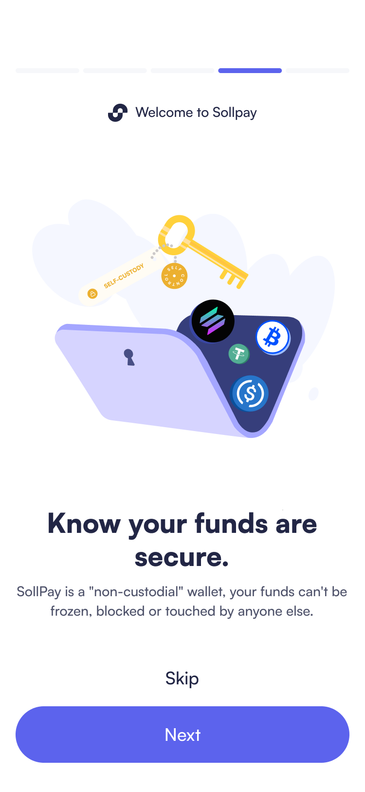
No more confusion, unnecessary complexity, and fear of losing money. From progressive onboarding to trust-building micro-interactions, SollPay transforms every crypto action into familiar financial experiences for complete beginners.
Strategic Language Choices
Eliminating complex terminology while keeping essential crypto concepts always paired with clear explanations in familiar language.
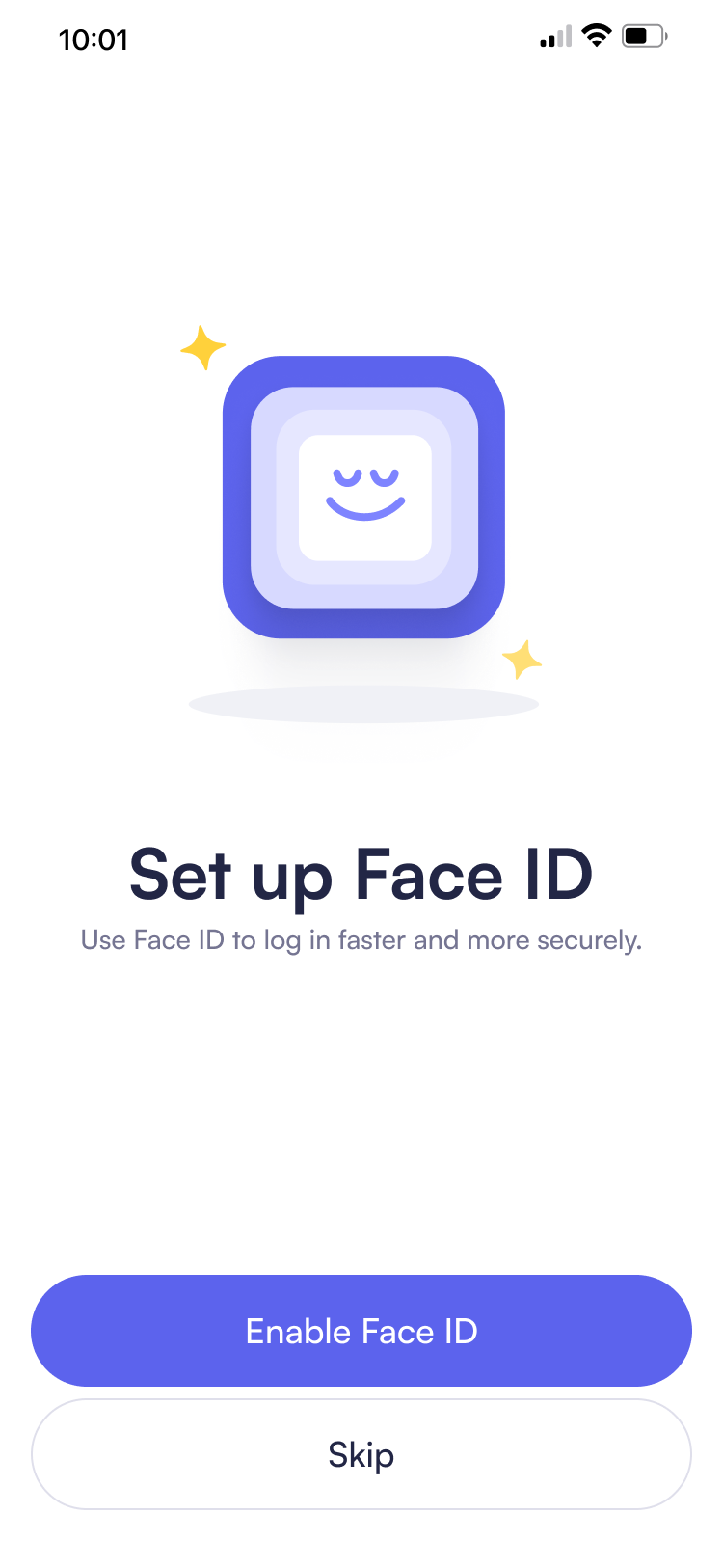
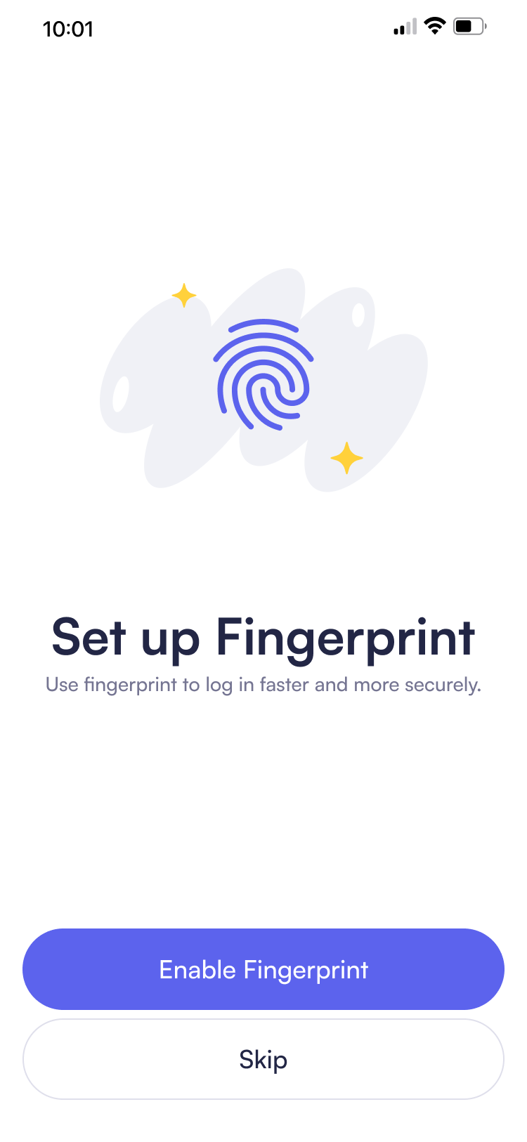
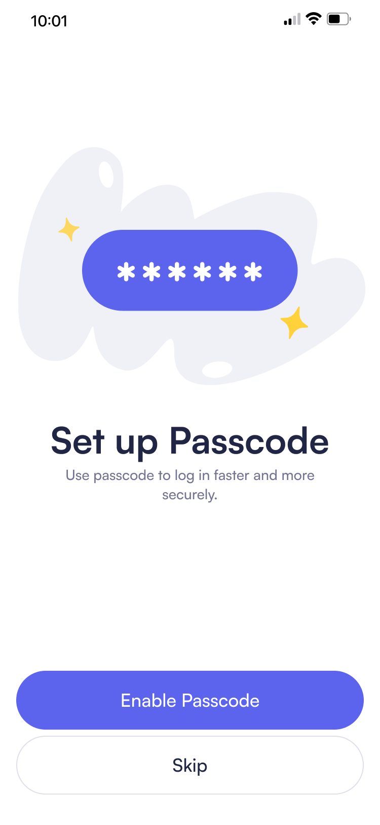
Trust Building Micro Interactions
Turning waiting periods into confident experiences where users feel informed and reassured rather than uncertain, ensuring every moment builds trust through clear communication about what's happening.
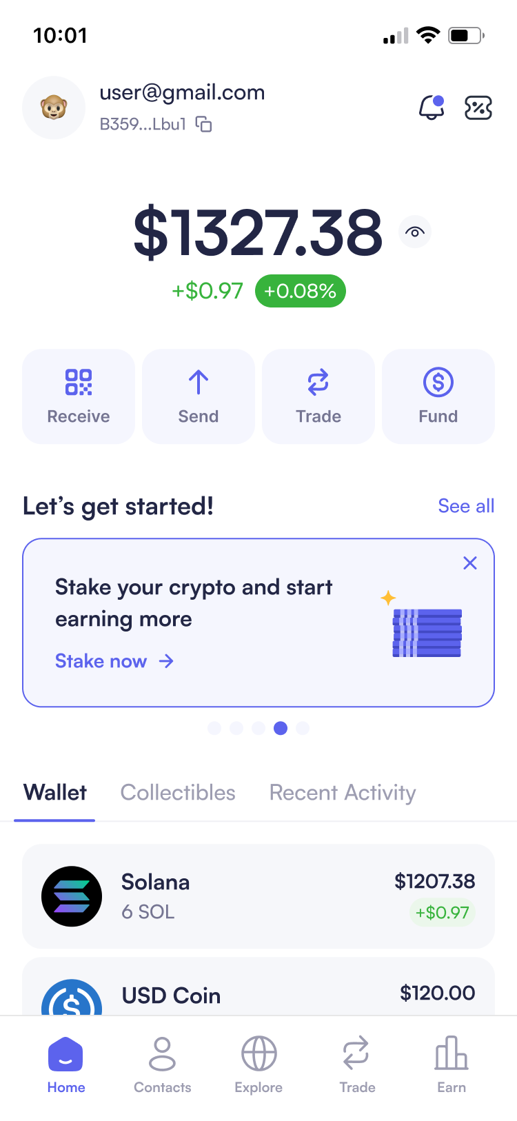
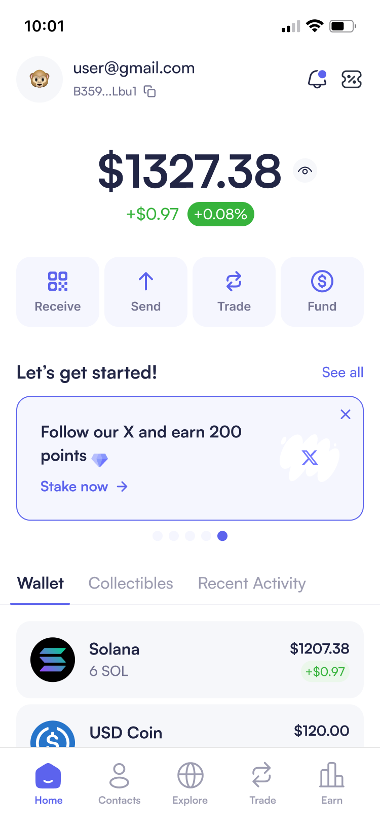
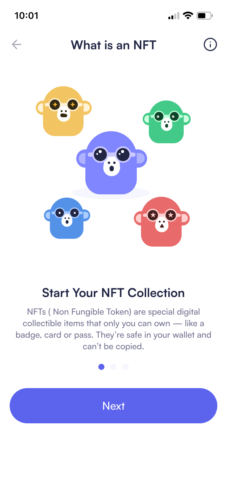
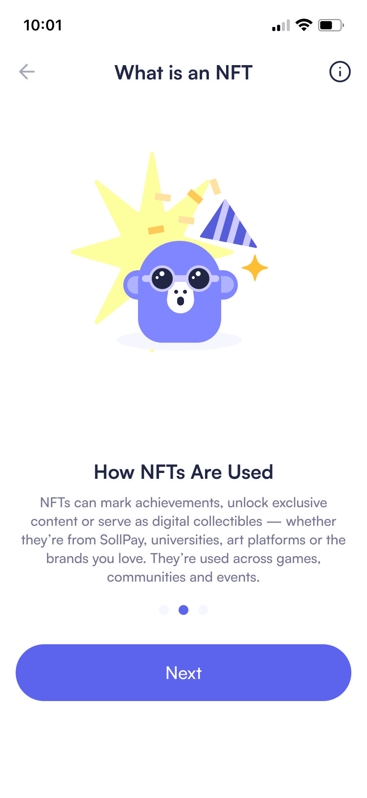
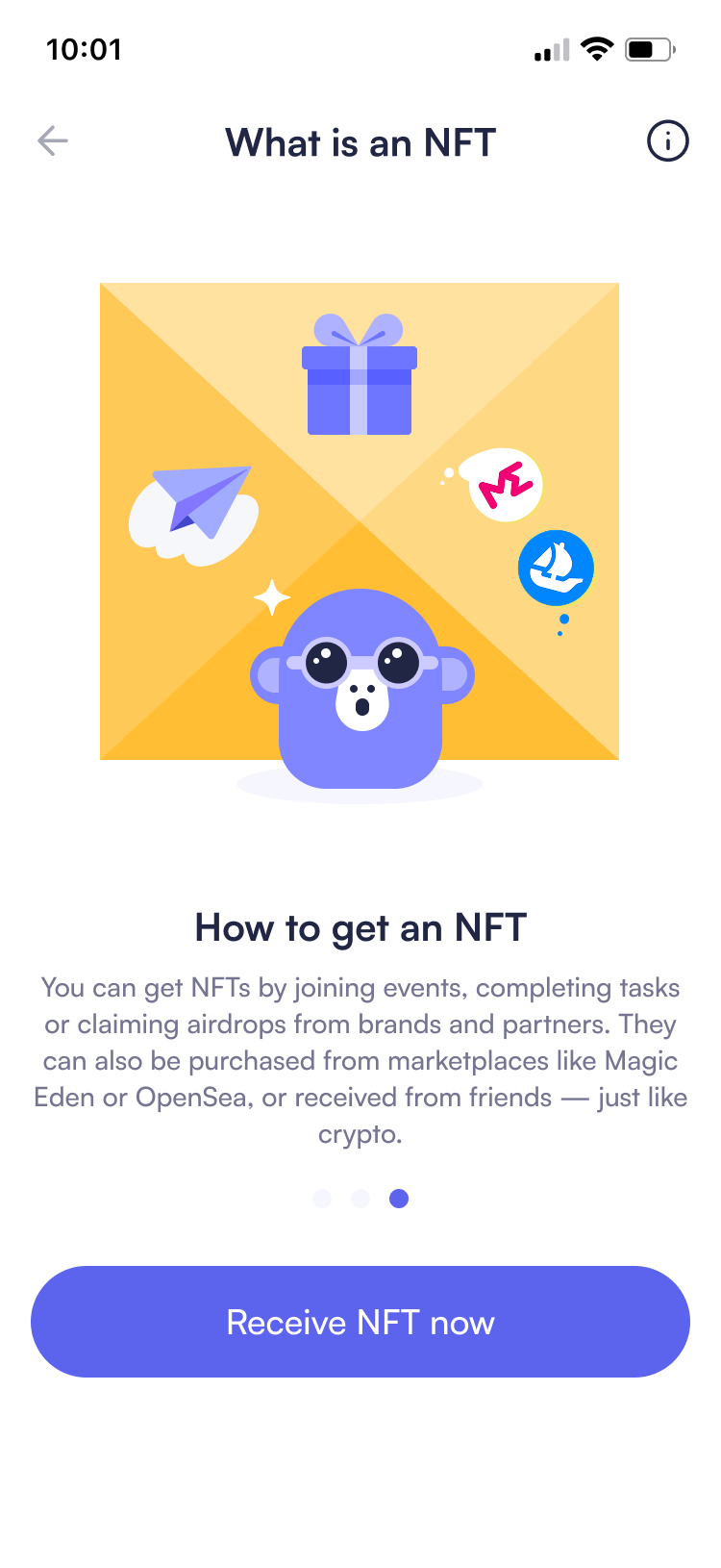
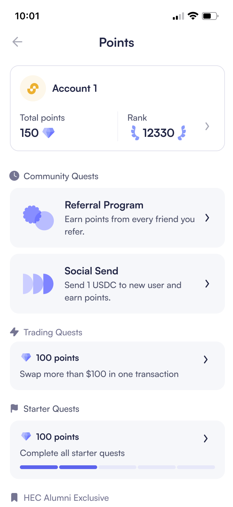
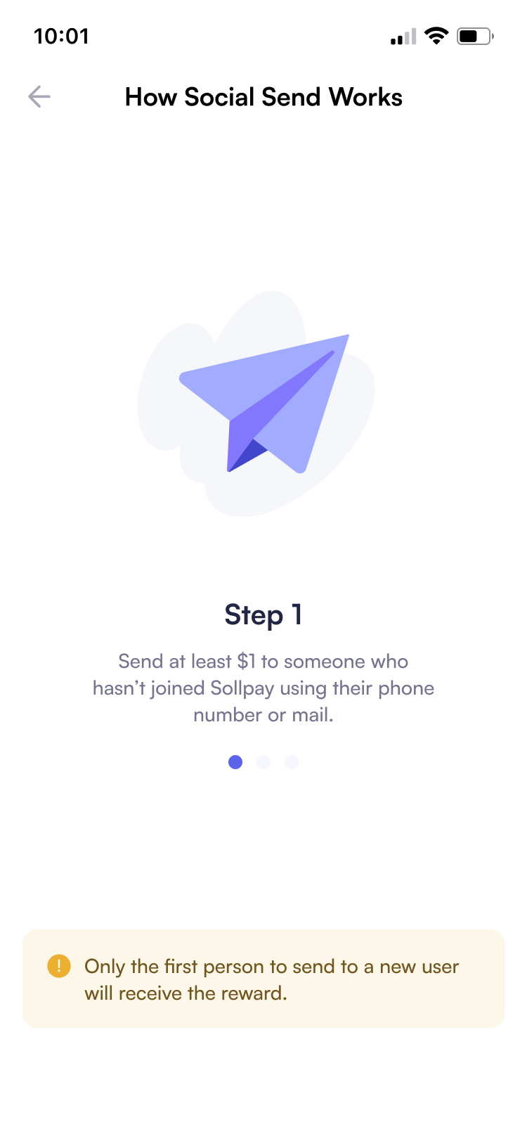
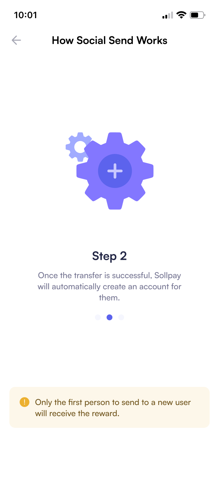
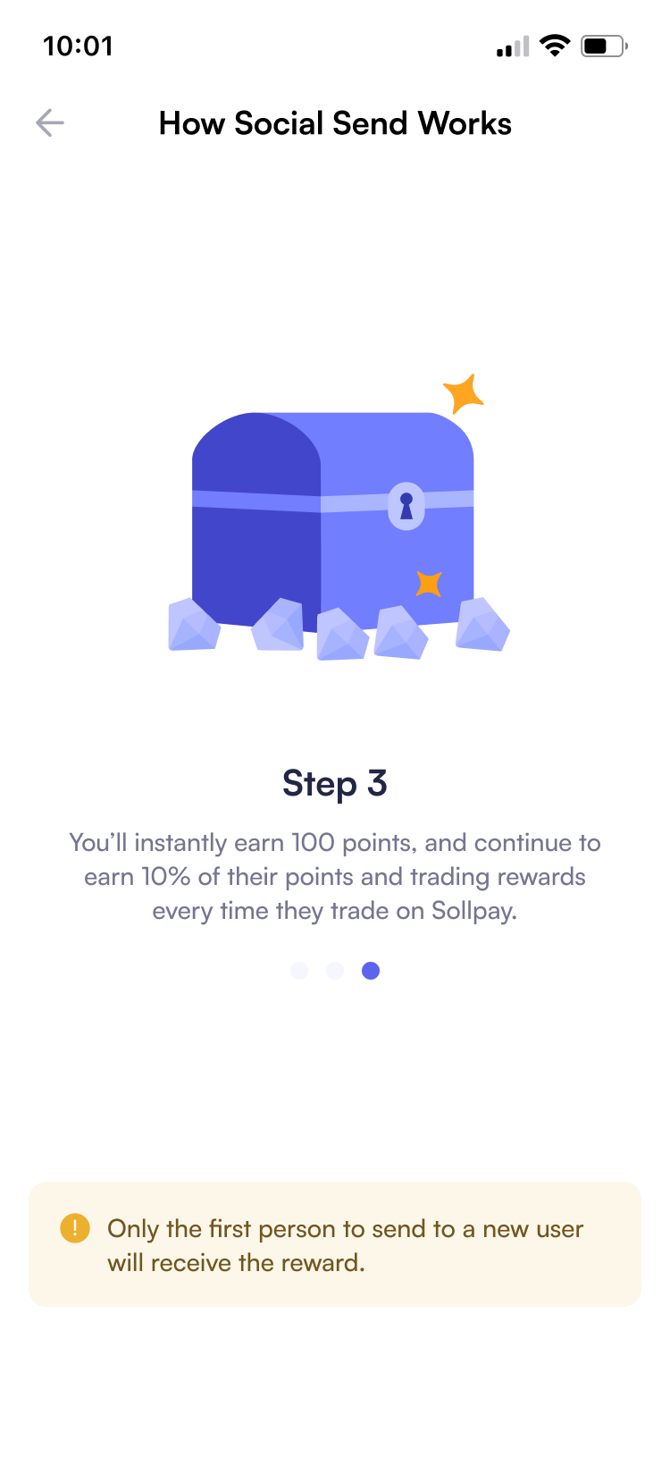
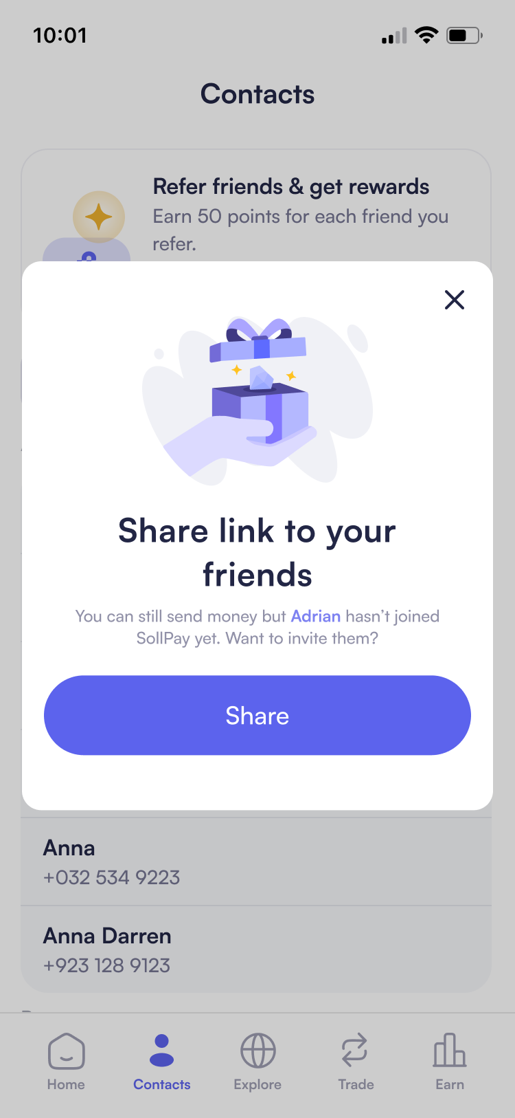
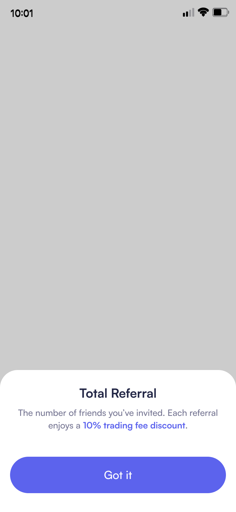
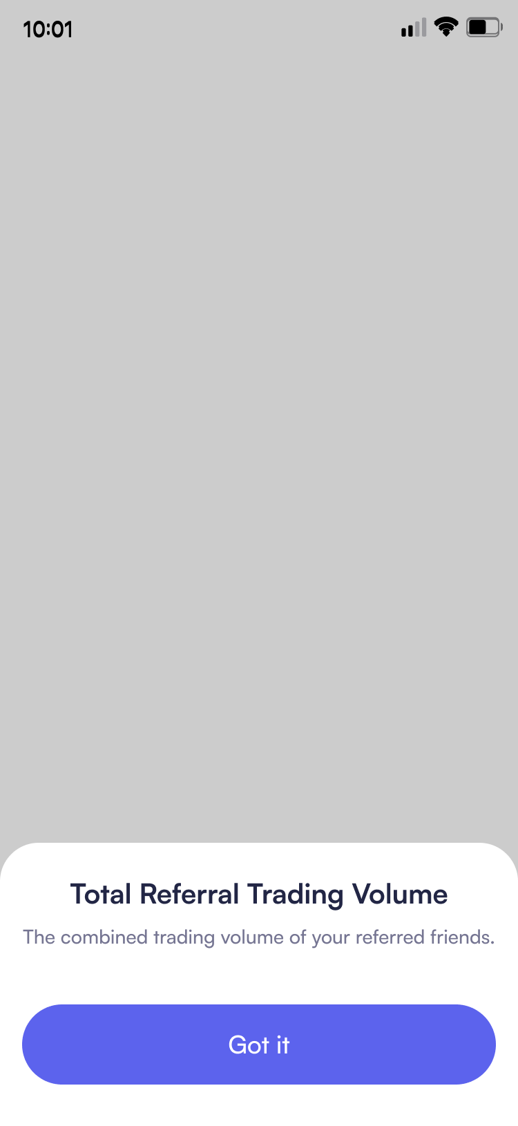
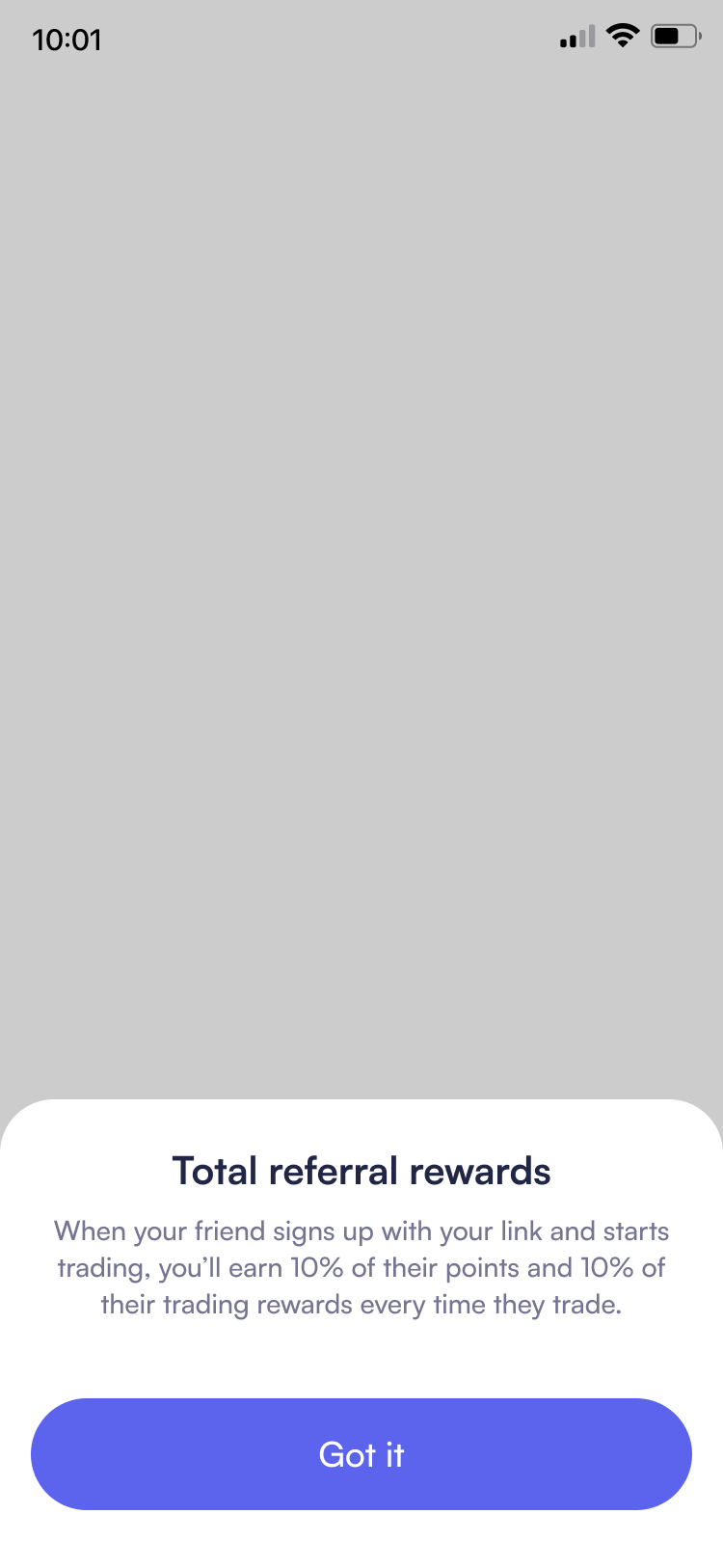
Progressive Action Discovery
SollPay introduces core crypto actions through a clear, points-based system enhanced with custom illustrations that make abstract crypto concepts instantly recognizable, transforming feature discovery from overwhelming choice paralysis into guided visual exploration.
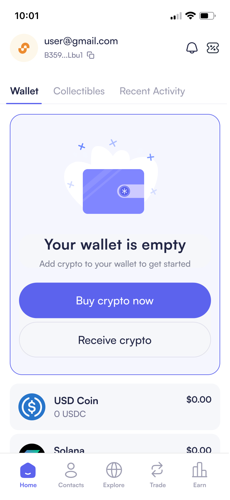
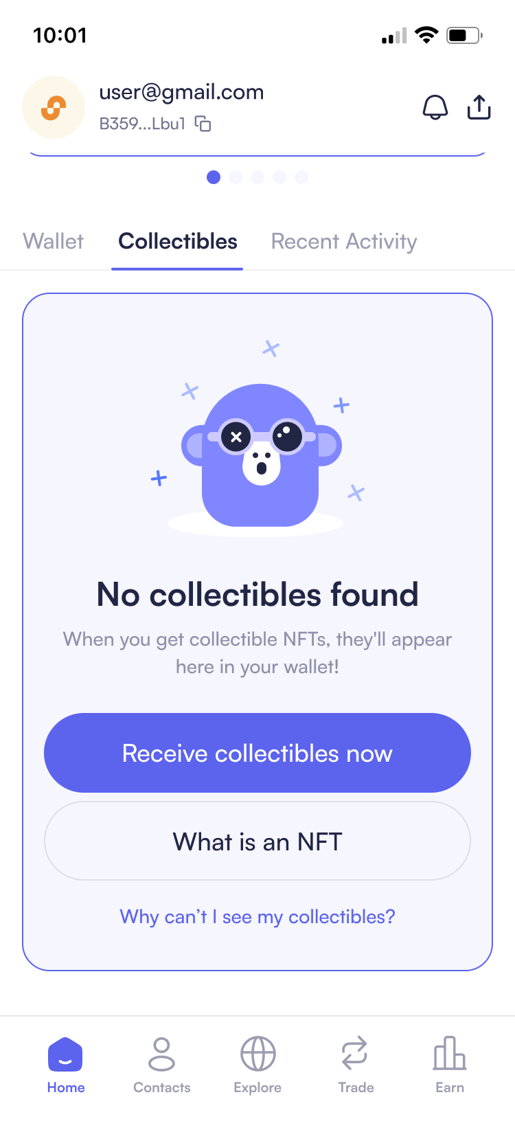
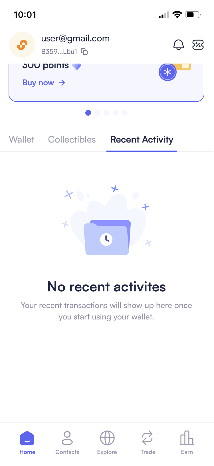
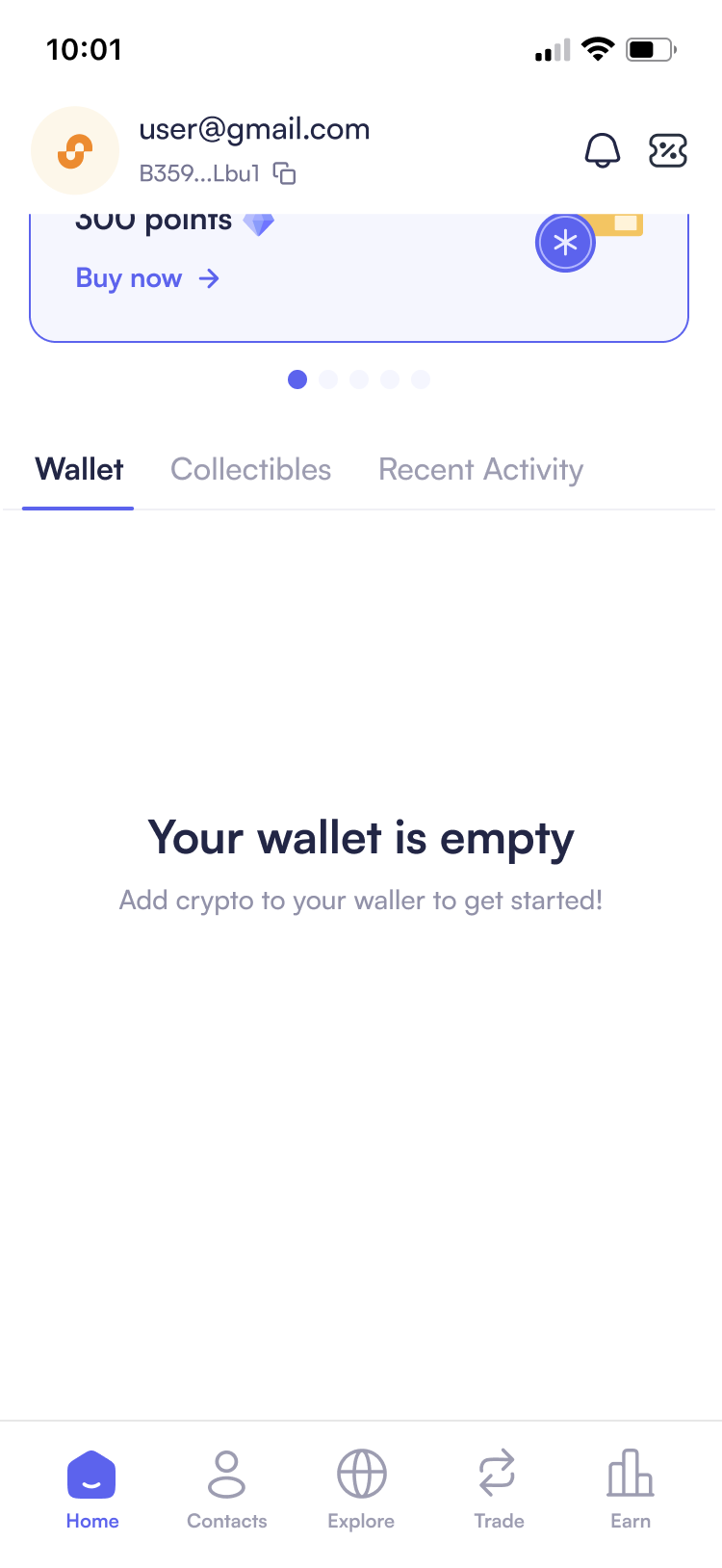
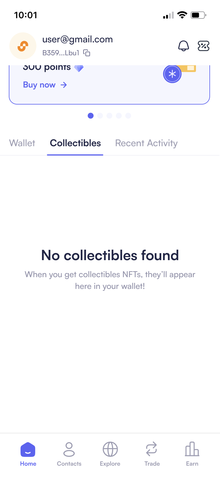
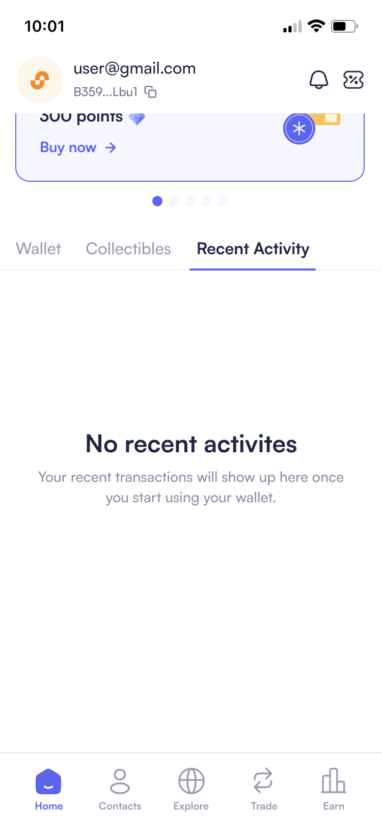
Empty State Guidance
Transforming dead-end moments into educational opportunities with clear CTAs and contextual onboarding flows, ensuring users always know their next step whether they have an empty wallet, no collectibles, or no recent transactions.
Token List with Direct Swap Access
Insufficient Balance Becomes Buy Flow
One-Tap Crypto Actions
Embedded swap buttons in token lists and actionable insufficient balance states, reducing common flows from 3 taps to 1 tap.
DISCOVER
Uncovering the Beginner's Struggles in Crypto
When I joined SollPay in January 2025, I knew nothing about crypto. This became an advantage - I experienced firsthand the confusion and intimidation that our target users would face.
I began exploring the Web3Auth UX Report (2023), one of the most comprehensive studies on onboarding challenges in the Web3 space:
At first glance, these seem like technical issues. But I noticed a pattern: several challenges were rooted in how the experience was designed and explained to users.
"Are these simply technical challenges or signs of a deeper user experience (UX) problem?"
To find the answer, I turned to Dobshynska's UX Study (2024), which provides an in-depth analysis of UX problems in crypto applications. The study revealed three core issues: difficulty managing wallets, lack of understanding of transaction mechanisms, and challenges in risk assessment and decision-making.
With this insight, I set out to validate whether these findings matched real-world experiences. I gathered insights from crypto beginners on Reddit, and our team conducted interviews with 3 new users and 1 experienced user who had tried helping others get started. The findings confirmed my suspicion:
What I heard from real users:
 A Reddit User • r/CryptoCurrency
Is it me or user interface(UI) of many wallets and exchanges sucks?
A Reddit User • r/CryptoCurrency
Current crypto wallets look exotic compared to our day to day finance apps.
 Alicia, 23, Marketing Executive
"I literally don't understand most of the crypto terms. Why can't they use words I see in normal finance apps like 'interest' or 'balance' instead of 'staking' and 'gas fees'?"
A Reddit User • r/CryptoCurrency
Some of the apps are intuitive from a UI standpoint but confusing from a practical standpoint... People need an easy wallet with an easy interface to allow people who don't know shit to stake.
 Elson Lau, 37, Senior Software Engineer
"I enjoy crypto, but when I tried to introduce it to my family, they gave up halfway. The steps were too complicated and I had to explain every single term."
 Daniel, 22, University Student
"I just want to try buying a small amount, but every step throws technical terms at me. There should be a short explanation for each word. Like how fintech apps explain savings goals."
From these insights, I developed user personas representing different crypto experience levels:

Annie, 23
University Student in Paris
- Curious about crypto but has never invested
- Comfortable with everyday apps, new to financial tools beyond basic banking.
- Start small and build confidence without feeling overwhelmed.
- Perceives crypto as risky and overly technical, unsure where to start.

Sophie, 25
Recent Graduate in Berlin
- Invest in stocks but not in crypto
- Confident with fintech apps, unfamiliar with crypto concepts.
- Grow salary through crypto and learn passive income strategies.
- Apps feel expert-focused, overwhelmed by jargon, fears making mistakes.

Dylan, 32
Product Manager in London
- Active trader who onboards friends into crypto.
- High confidence with wallets, bridging, and key management.
- Wants beginner-friendly tools to recommend to others.
- Friends quit due to poor UX and confusing terminology.
From these insights, I identified two major problems beginners face:
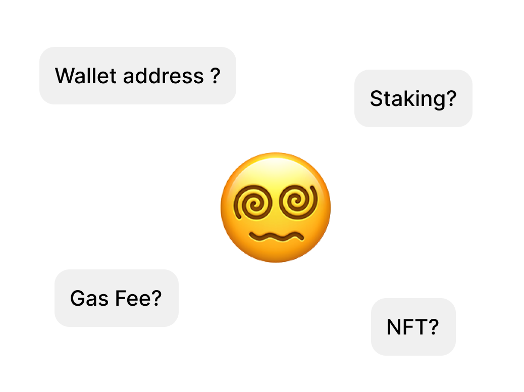
1. Too much technical crypto terms
User feel confused or intimidated even before taking action.

2. Unclear step by step process
Users lack confidence and perceive crypto actions as risky.
DESIGN STRATEGY
Reducing Barriers to Entry: Simplicity
I developed a design approach focused on three key reductions:
Reducing confusion, reducing fear, and reducing friction.
Reduce confusion
Reduce Friction
Reducing Fear
This framework guided every design decision, from language choices to interaction patterns to visual hierarchy.
SOLUTION DEVELOPMENT
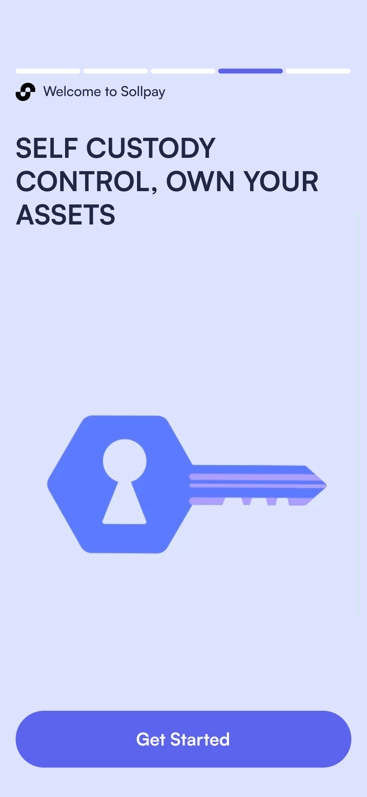
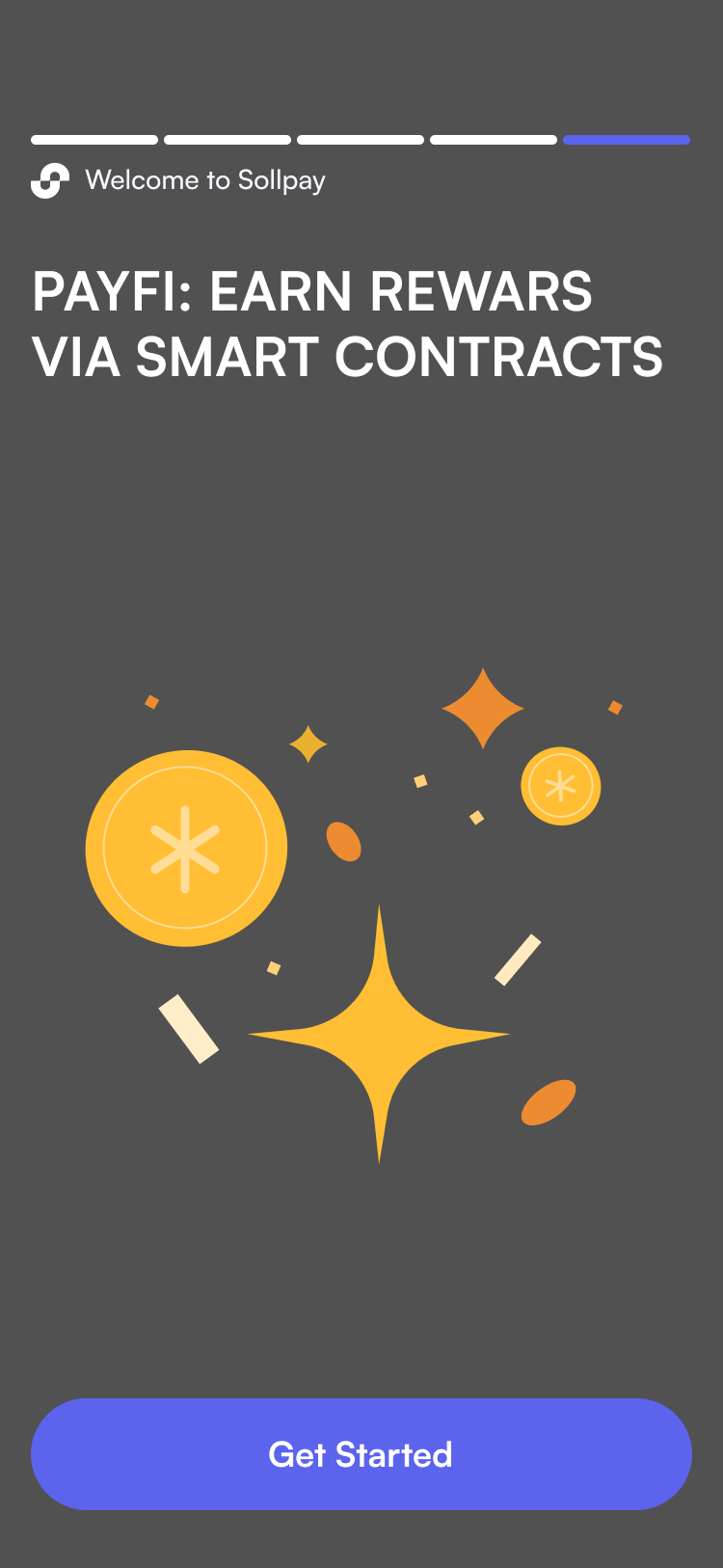
01. Progressive Language Simplification
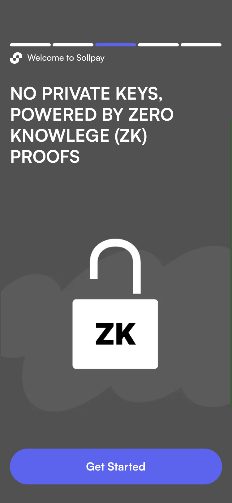
Initial onboarding used crypto-native terminology that confused and intimidated beginners. Users struggled with concepts like self-custodial wallets, private keys, zero-knowledge proofs, self-custodial control, and PayFi smart contracts. To make SollPay more accessible, I simplified the language throughout the onboarding experience, replacing technical jargon with clear, everyday terms users could understand immediately.
02. Creating an Approachable Visual Identity
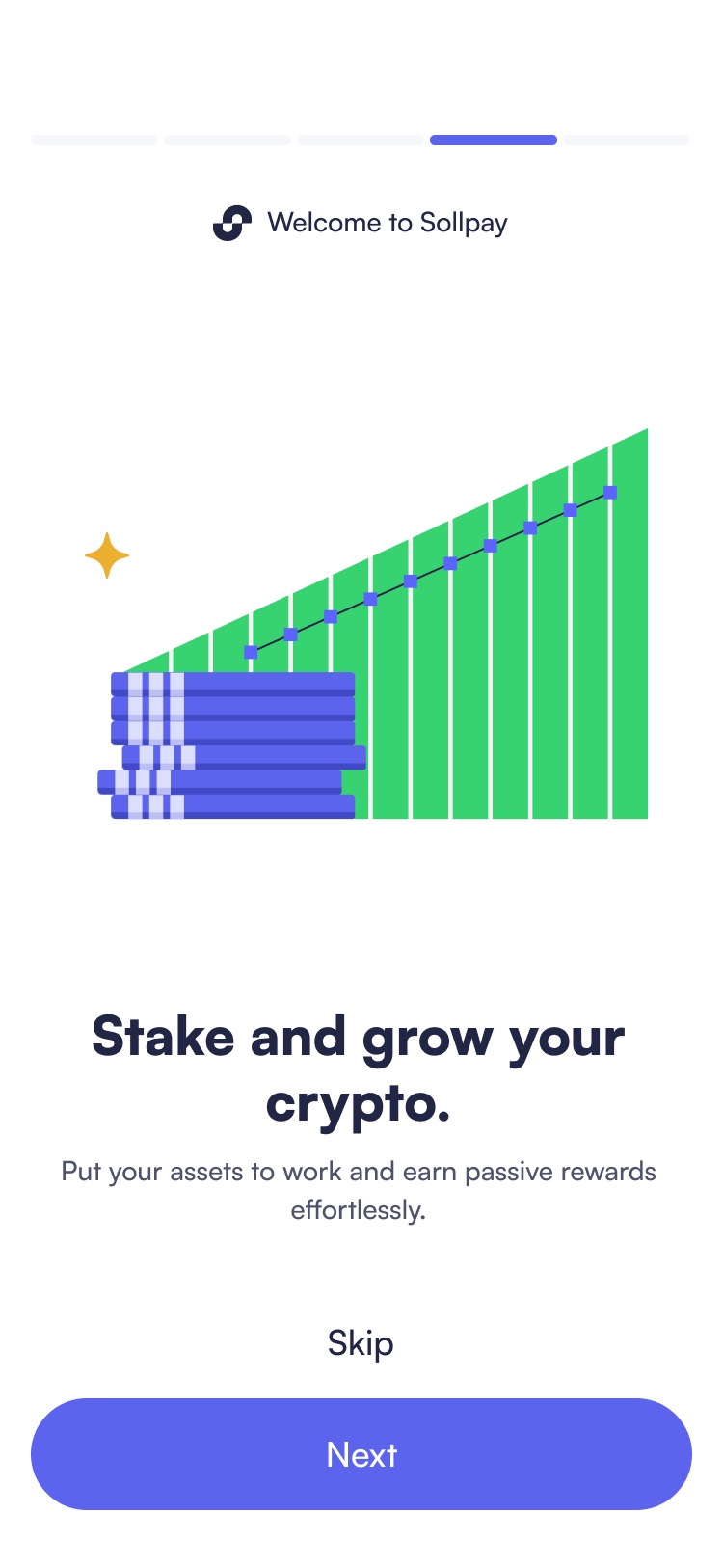
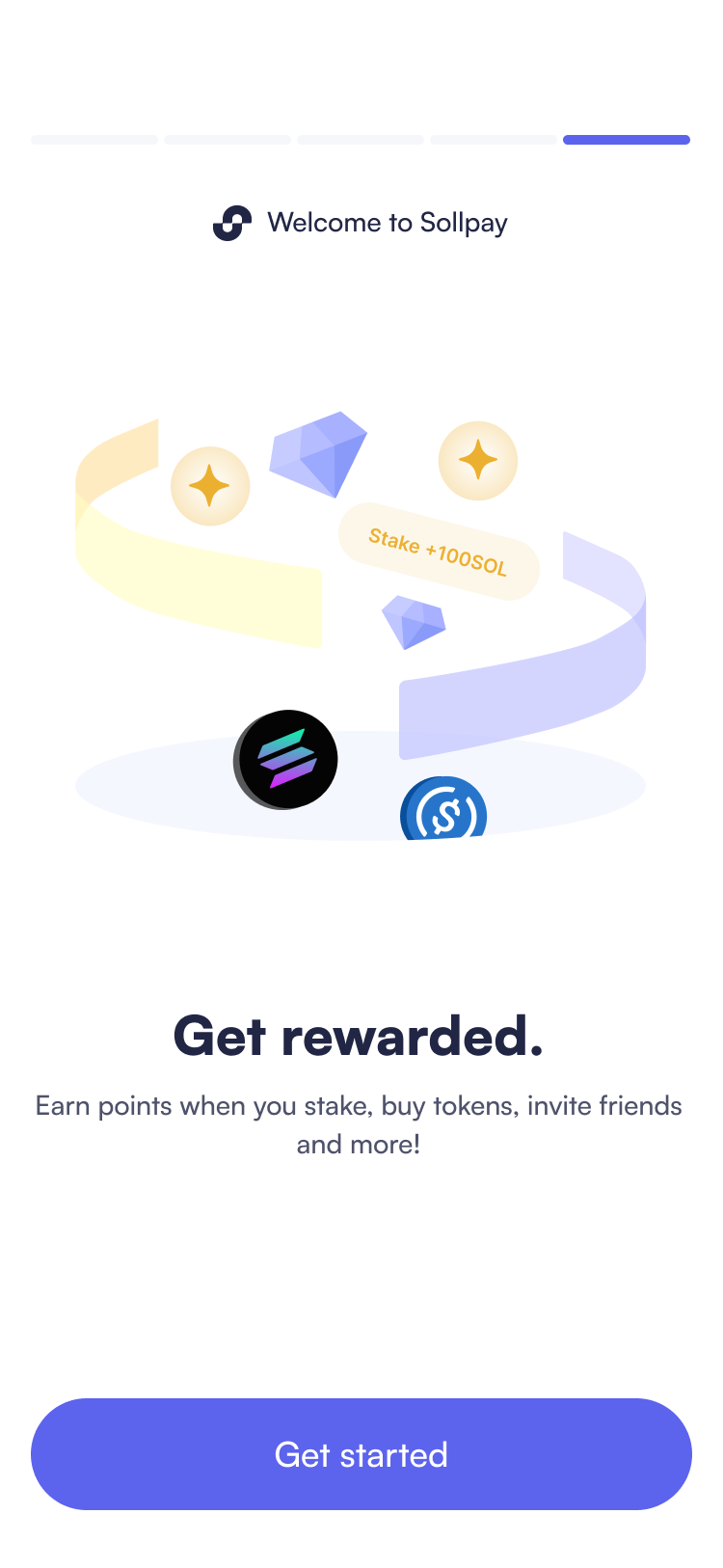
Crypto apps often feel cold and technical, which can be intimidating for newcomers. To make SollPay more welcoming for beginners, I developed a cohesive visual language using warm, geometric illustrations with a friendly character style. Each illustration serves a specific purpose:
- Action metaphors – visual representations like coins flowing for transfers or stacking for earning to make abstract concepts tangible
- Educational moments – step-by-step visualizations that guide users through complex processes
- Contextual clarity – illustrations that provide visual cues to aid understanding when terminology or concepts are unfamiliar
- Progress feedback – animated loading states with progress bars and reassuring copy to reduce anxiety during wait times. For the 15-second wallet initialization, I transformed this technical constraint into a moment that reinforces the app's friendly character.
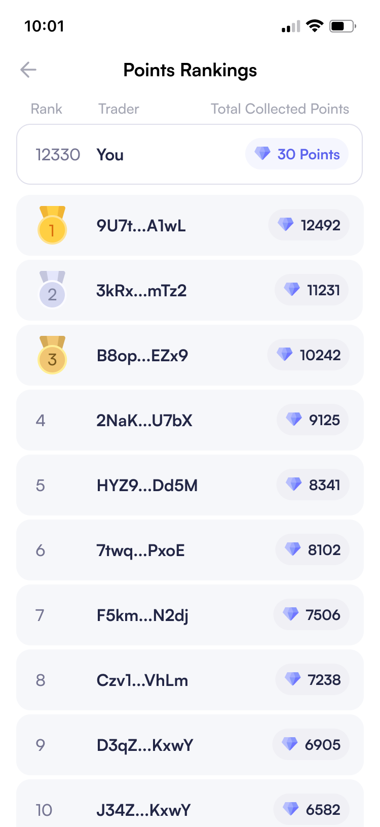
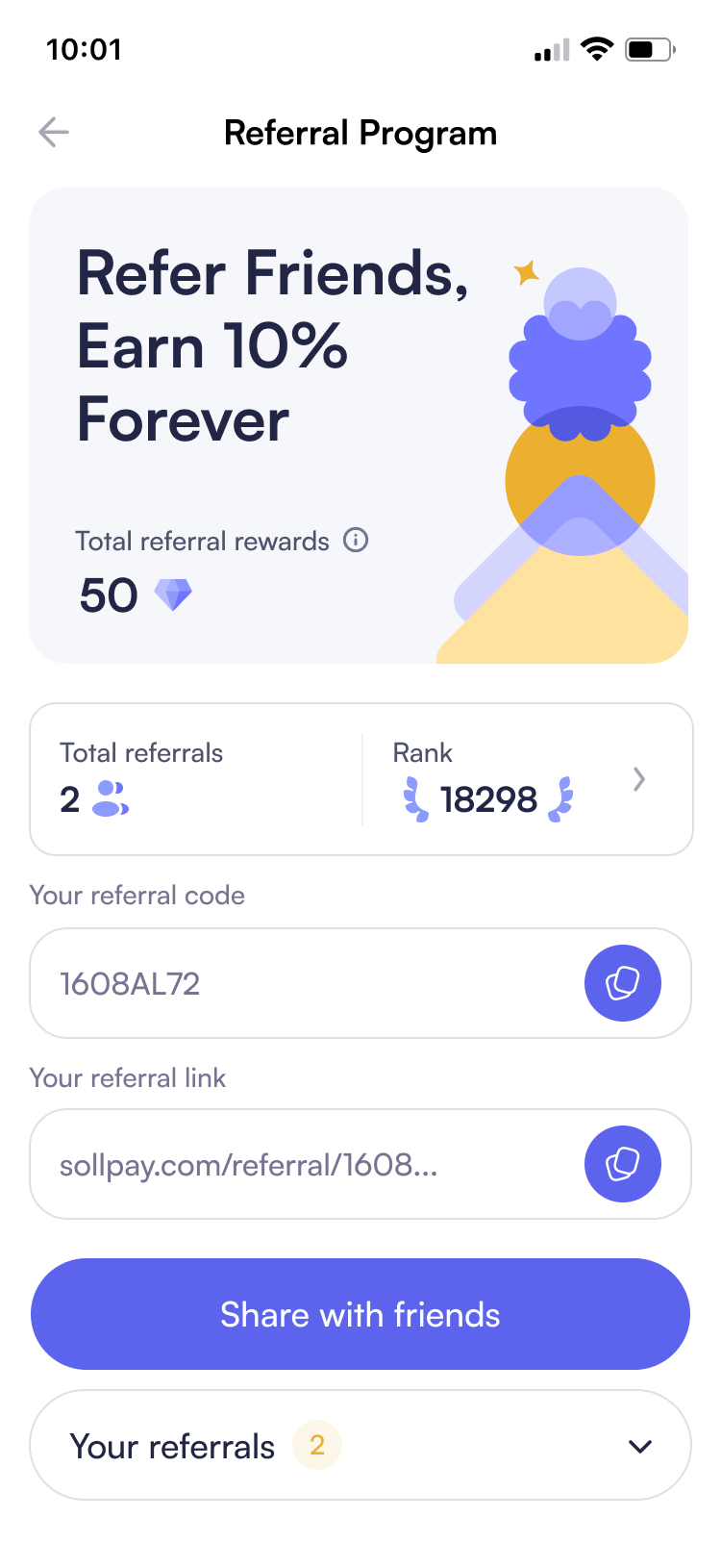
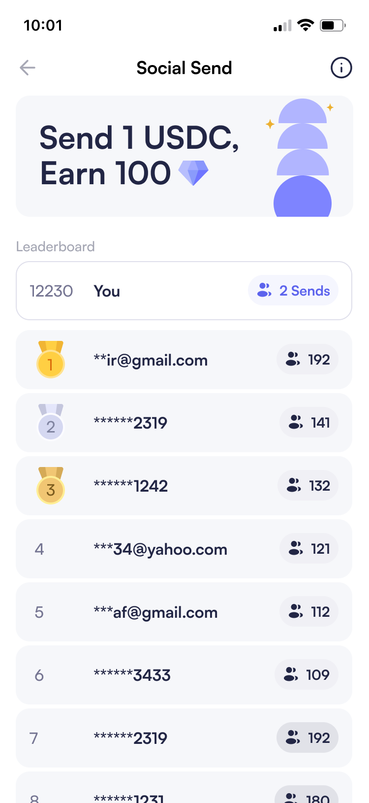
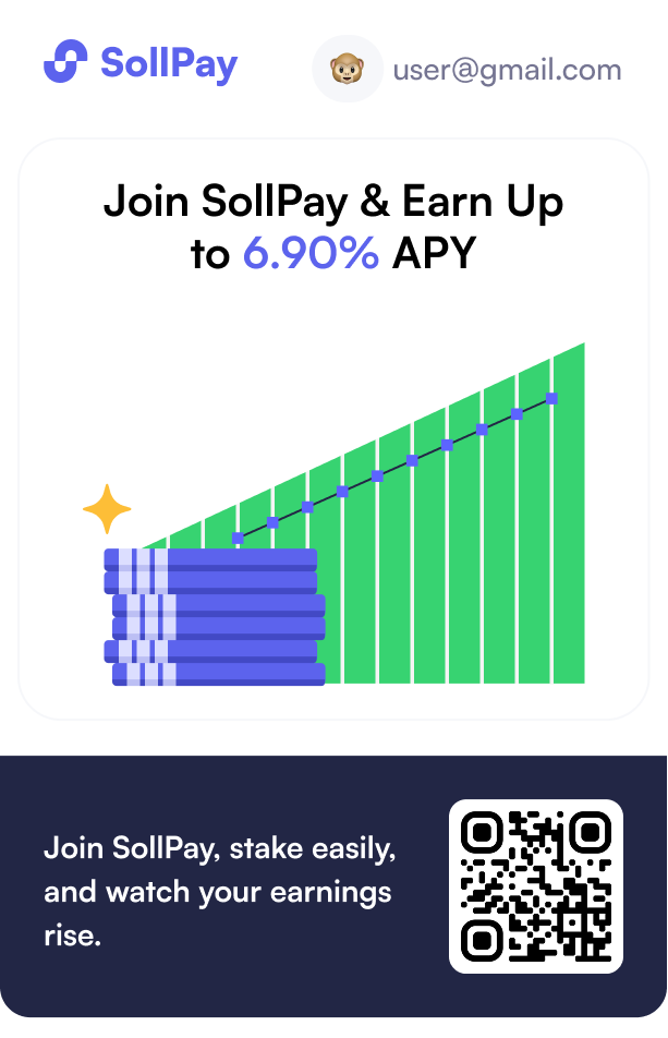
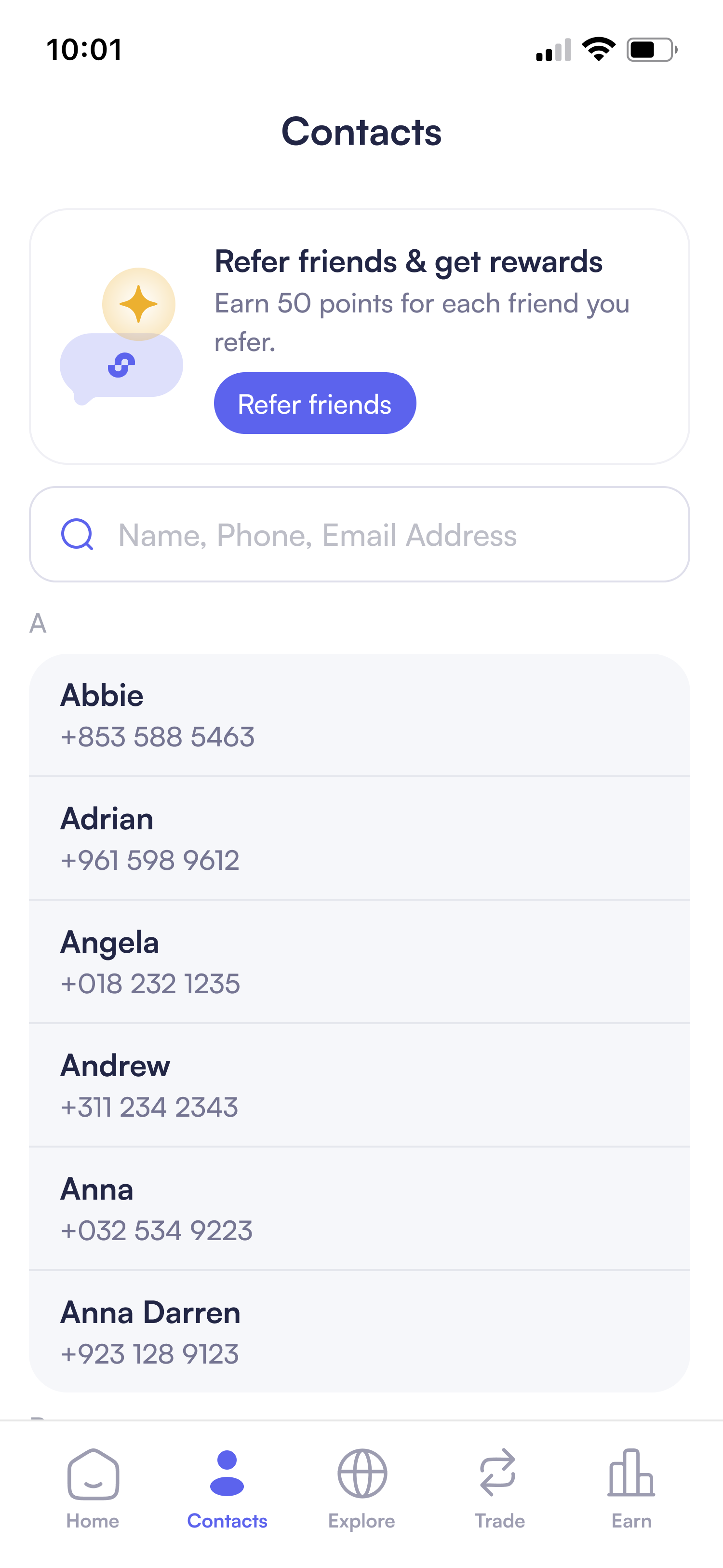
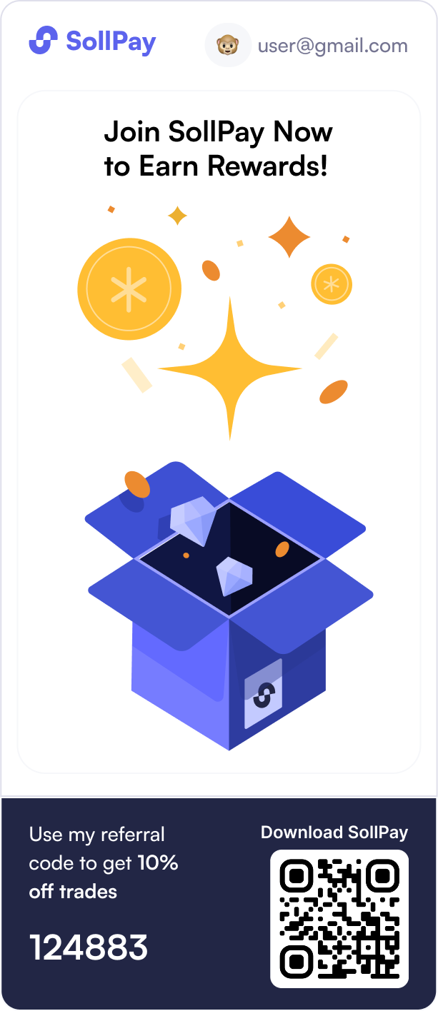
Beyond core product flows, I extended this visual system to the ranking and points campaign, creating a fun and joyful experience. I also designed shareable cards with engaging illustrations to encourage social sharing and attract new users.

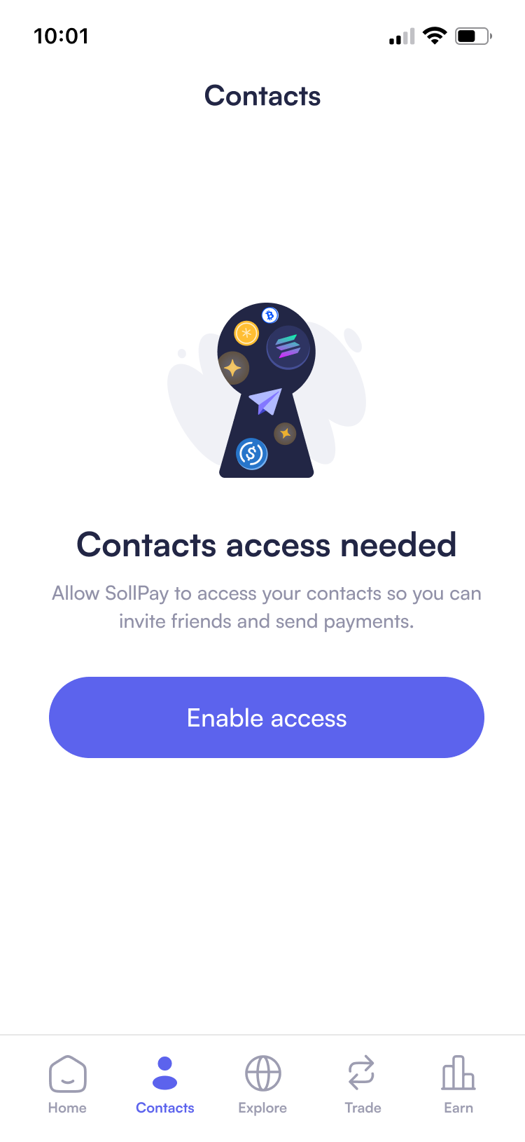
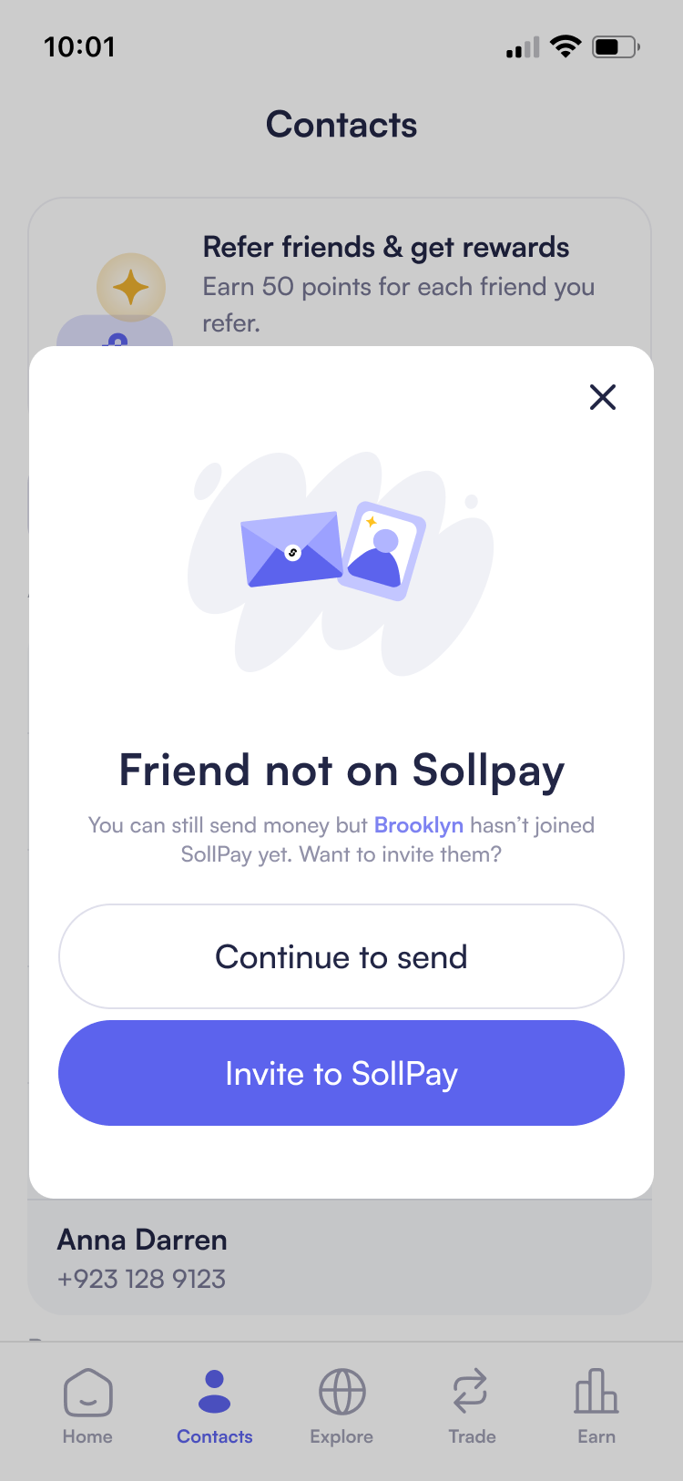
03. Designing Empty States with Guidance and Clarity
New users frequently encountered empty states across the wallet, collectibles, and activity sections with no clear path forward. This lack of guidance created friction at a critical moment when users were deciding whether to engage with the app.
How can empty states guide action instead of causing hesitation?
Rather than treating empty states as passive placeholders, I designed them as intentional guided entry points that not only explain the situation but also activate confidence and action.
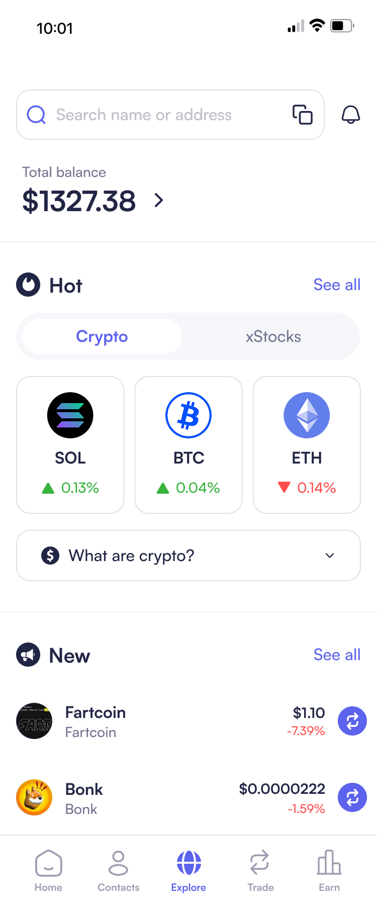
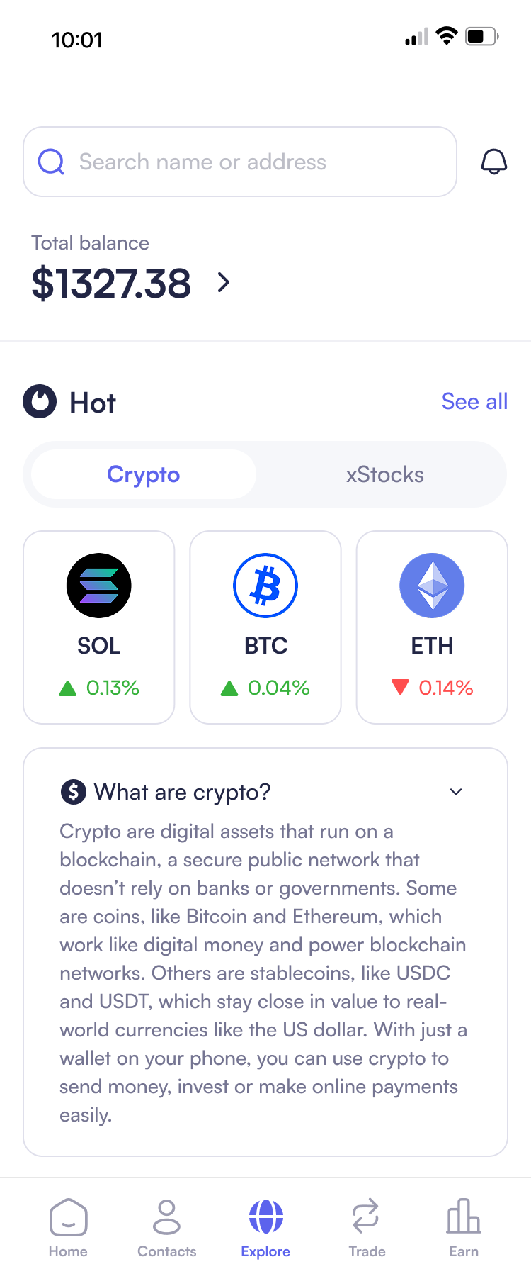
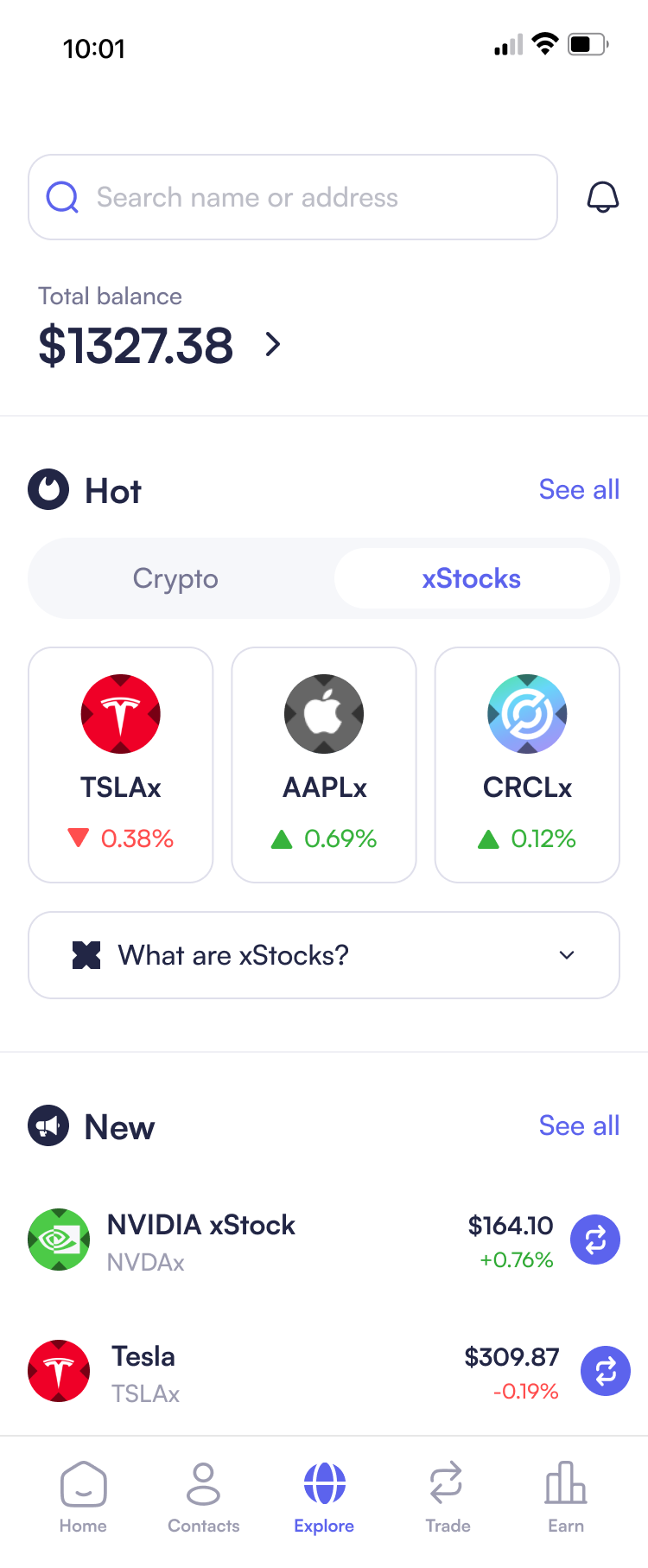
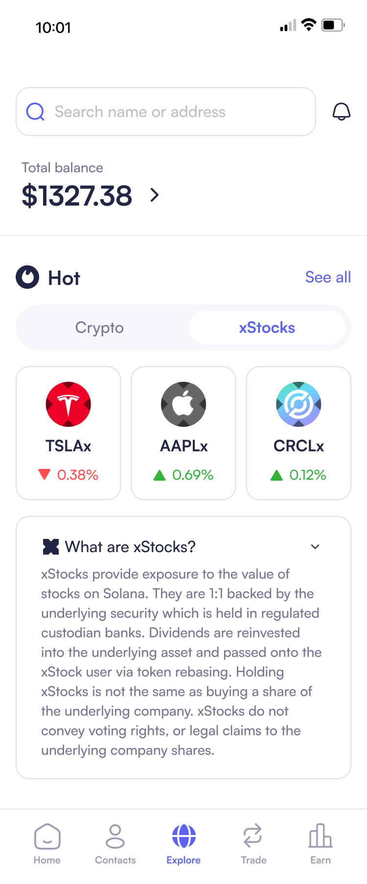
04. Guided Token Discovery
Next, we found that some users reported feeling overwhelmed, saying "I don't know where to start with so many options." They felt lost without understanding the differences between crypto and xStocks. The challenge was:
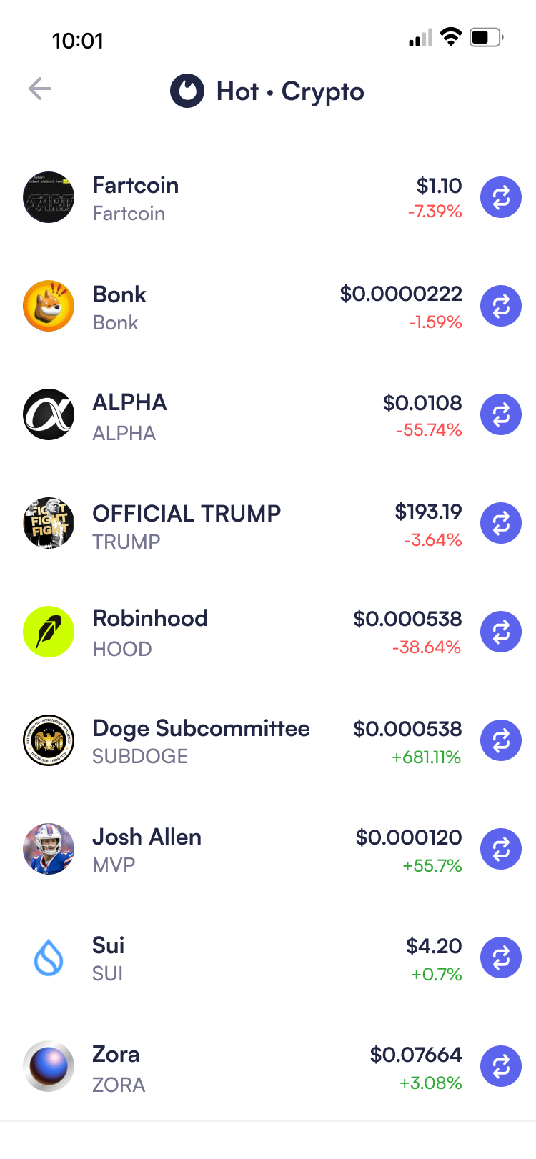
Explore page overwhelmed beginners with hundreds of token choices without context.
To solve this, we implemented two key improvements: a curated "Hot" section showcasing trending tokens to provide a clear starting point, and expandable educational sections ("What are crypto?" and "What are xStocks?") that explained the fundamental differences between these asset types, empowering users to make confident investment decisions.
05. Interaction Optimization
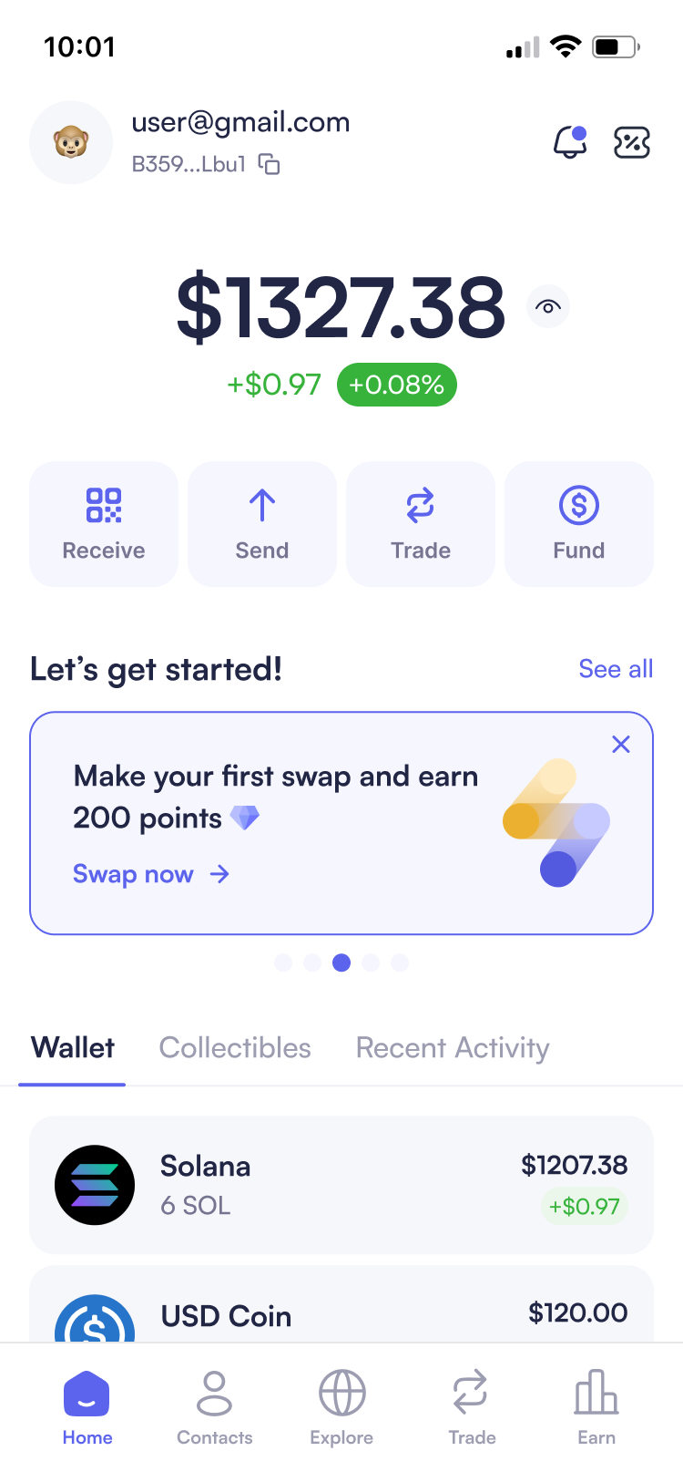
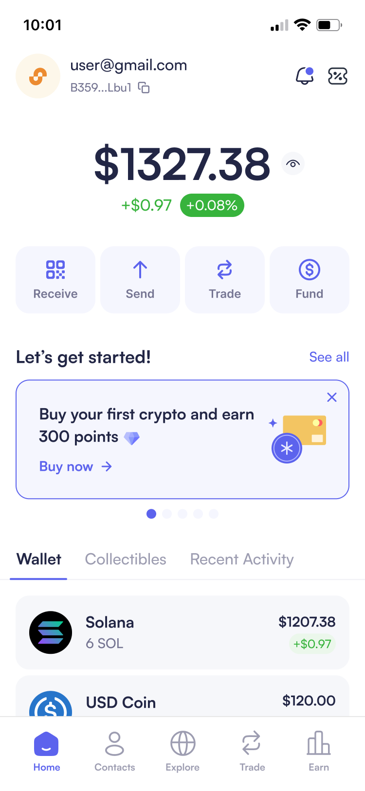
User testing revealed that lengthy multi-step flows caused confusion and led to transaction abandonment. To address this, I identified opportunities to reduce friction and create faster access points for common actions:
- Embedded swap buttons in token lists to reduce the swap initiation from 2 taps to 1 tap by eliminating navigation to detail pages
- Quick action buttons on the home screen for one-tap access to key functions
- Contextual add funds button that reduces the flow from 3+ taps to 1 tap when balance is insufficient
Embedded swap buttons
Four core action buttons
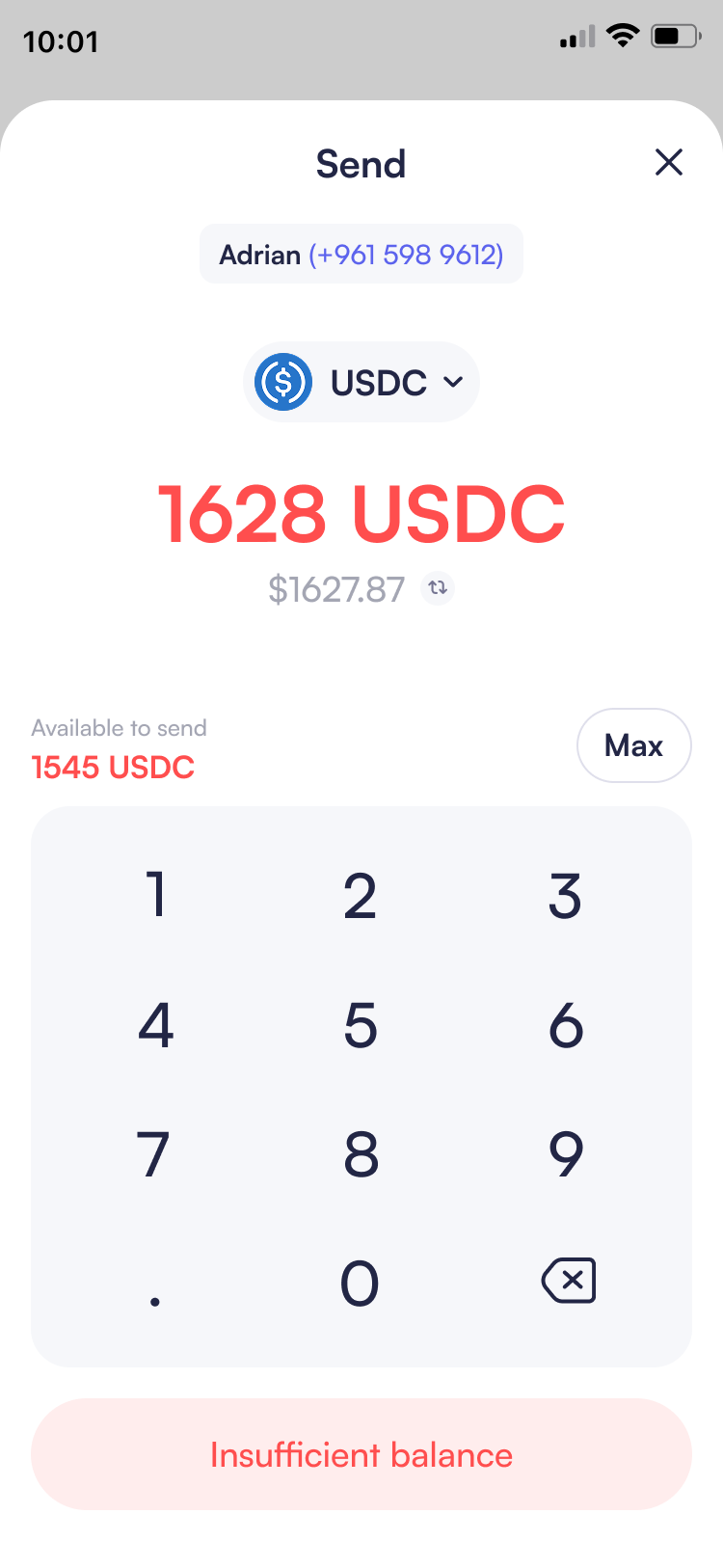
When user has insufficient balance
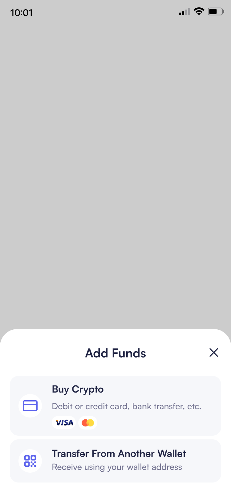
Click the insufficient balance button
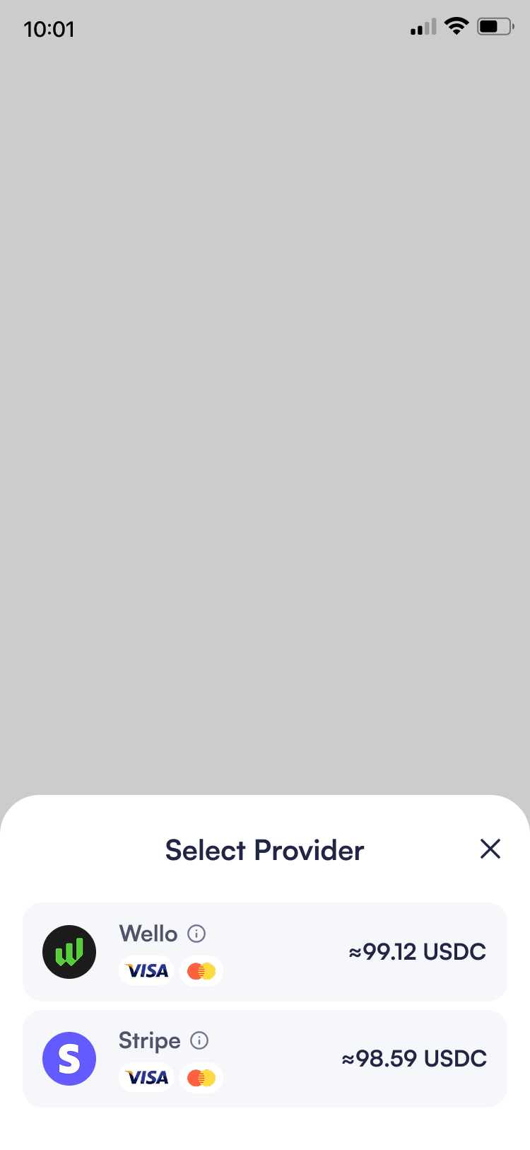
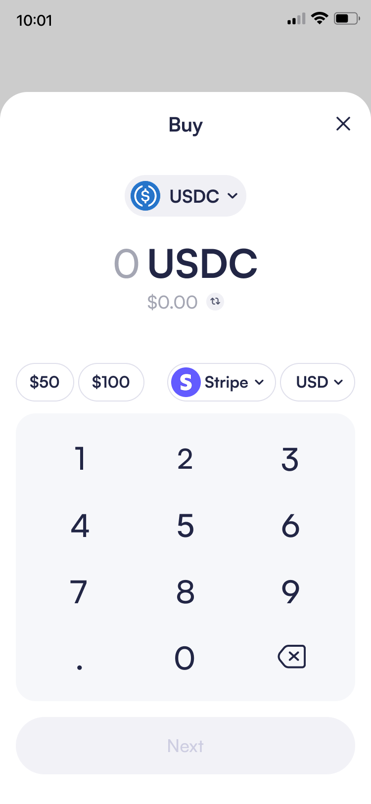
06. Streamlining Purchase Flow
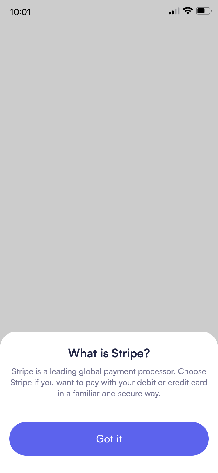
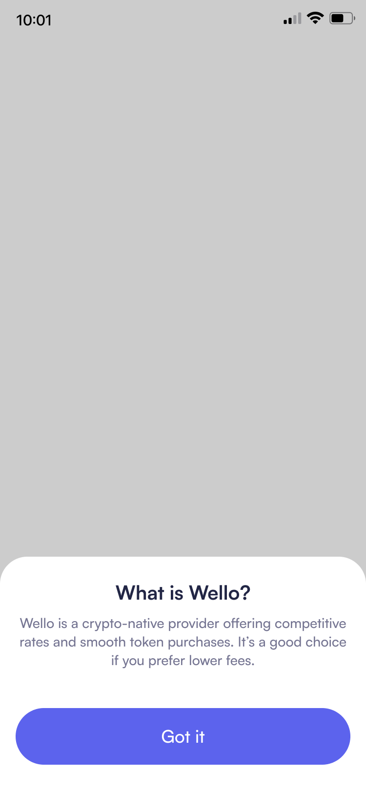
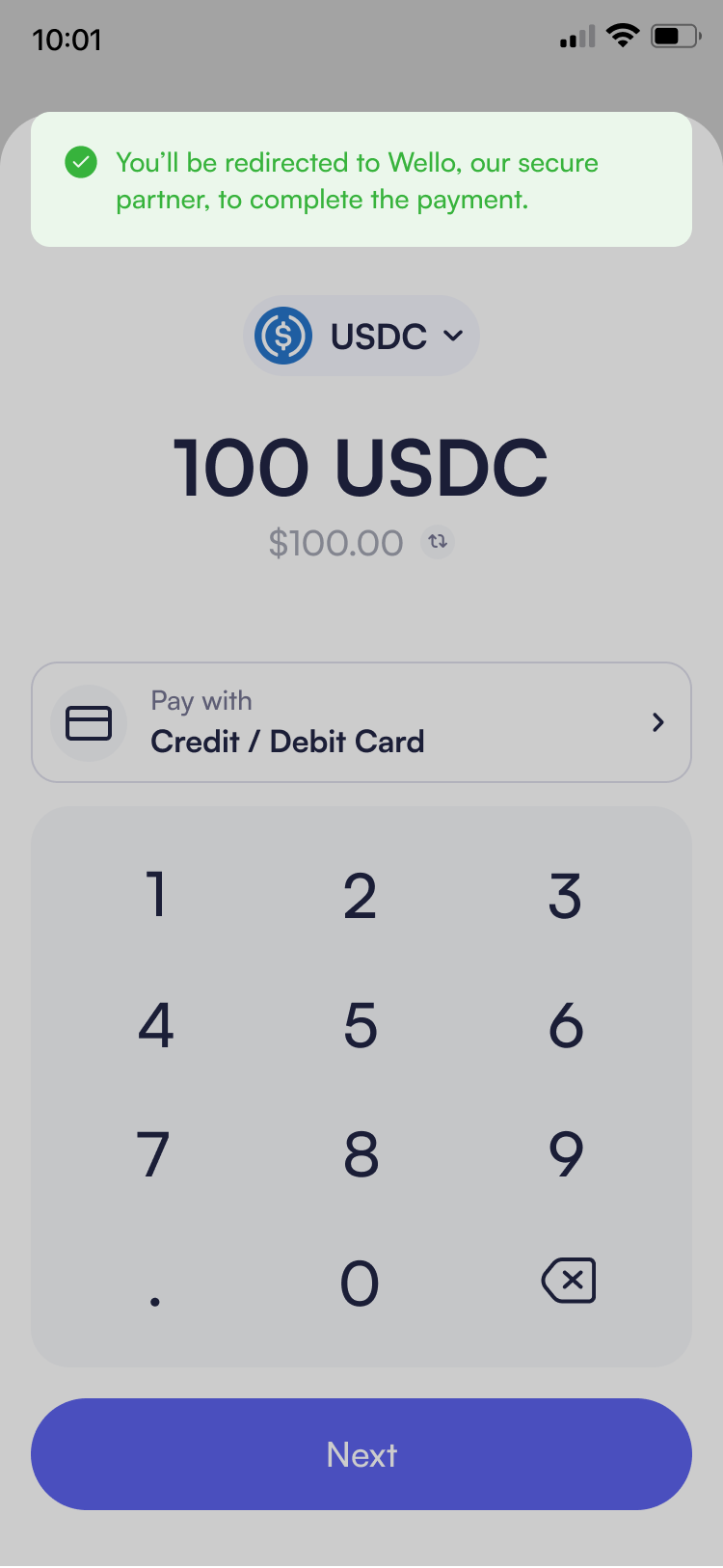
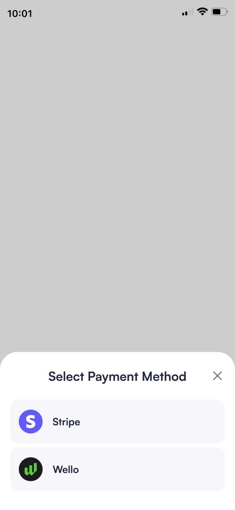
User feedback revealed confusion around payment providers and methods. The initial design presented unfamiliar options like "Stripe" and "Wello" without context, leaving users uncertain about what these services were, which payment methods they supported, and how they differed. Additionally, the "USD" currency selector caused confusion as users didn't understand its purpose. To address these issues, I made several design refinements:
- Added descriptive text under "Buy Crypto": "Debit or credit card, bank transfer with Visa/Mastercard icons for instant recognition of supported payment methods
- Included "What is Stripe?" and "What is Wello?" tooltips with contextual explanations to educate users about these payment providers
- Added estimated purchase previews showing how much crypto users would get through each provider
- Added a redirect notification: "You'll be redirected to Wello, our secure partner, to complete the payment" to set expectations before navigating to third-party sites
- Repositioned the currency selector beside the amount input on the keypad for better visibility and immediate understanding of which currency is being used
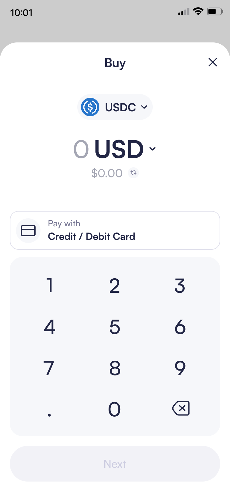
Initial purchase screen
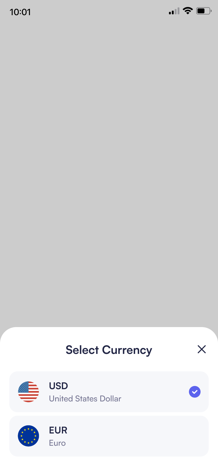
Click the currency dropdown
Click Next button
Click the Stripe info icon
Click the Wello info icon
After selecting provider
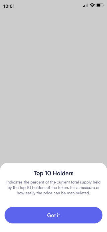
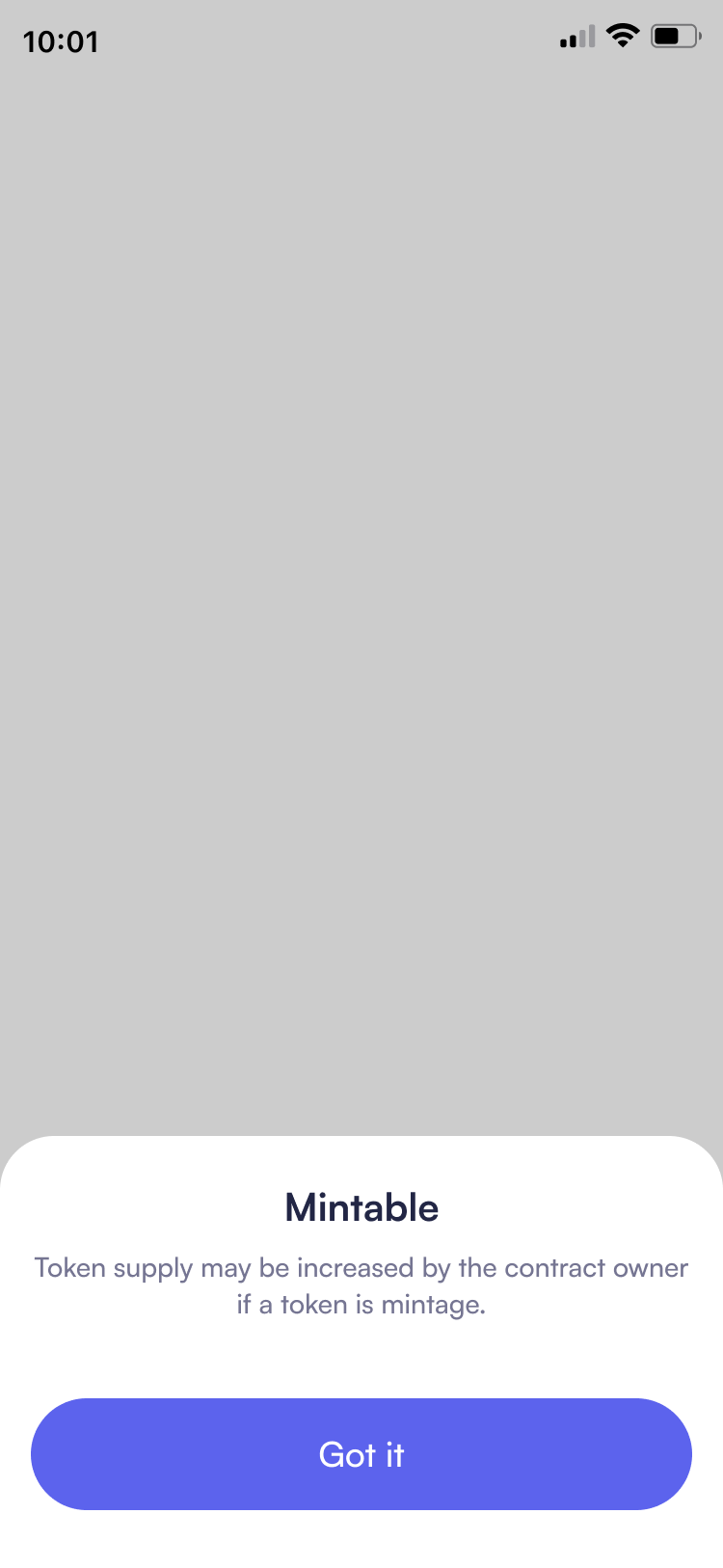
07. Contextual Education System
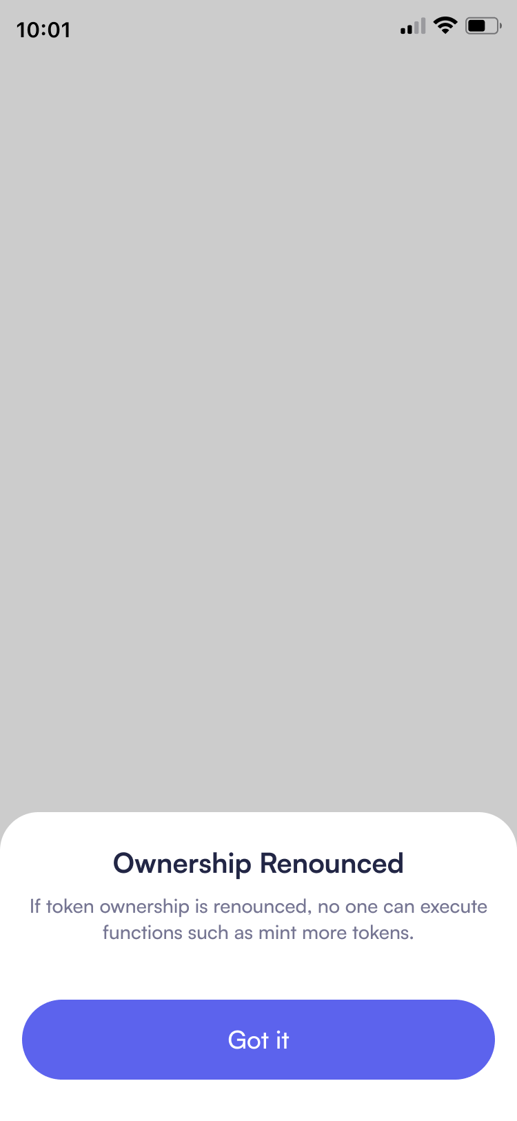
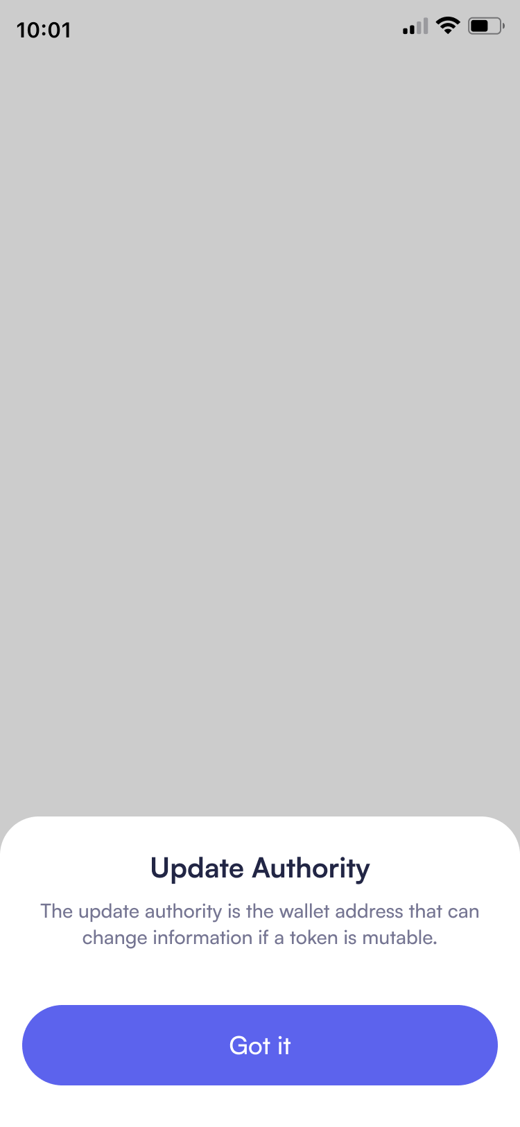
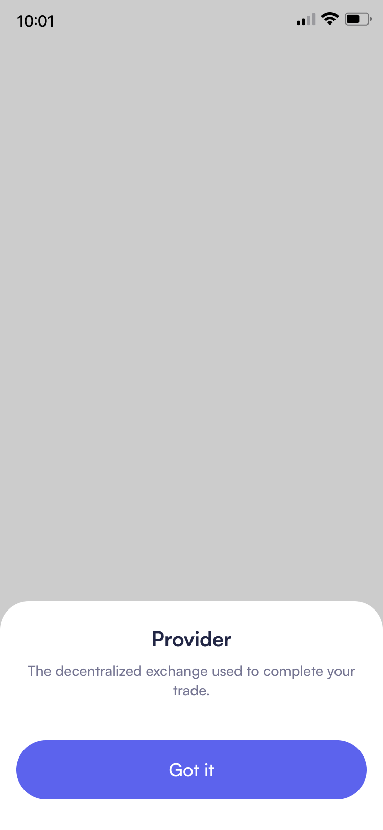
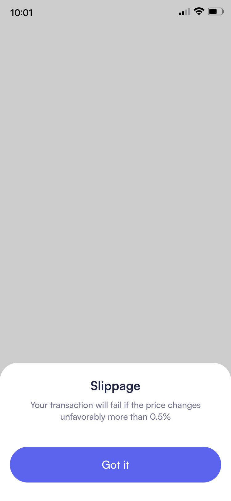
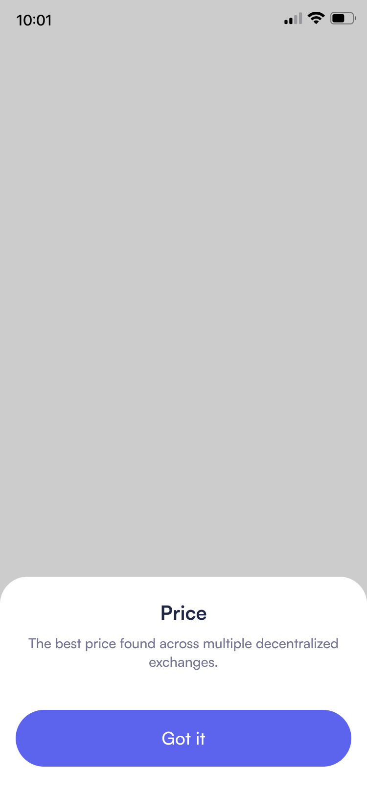
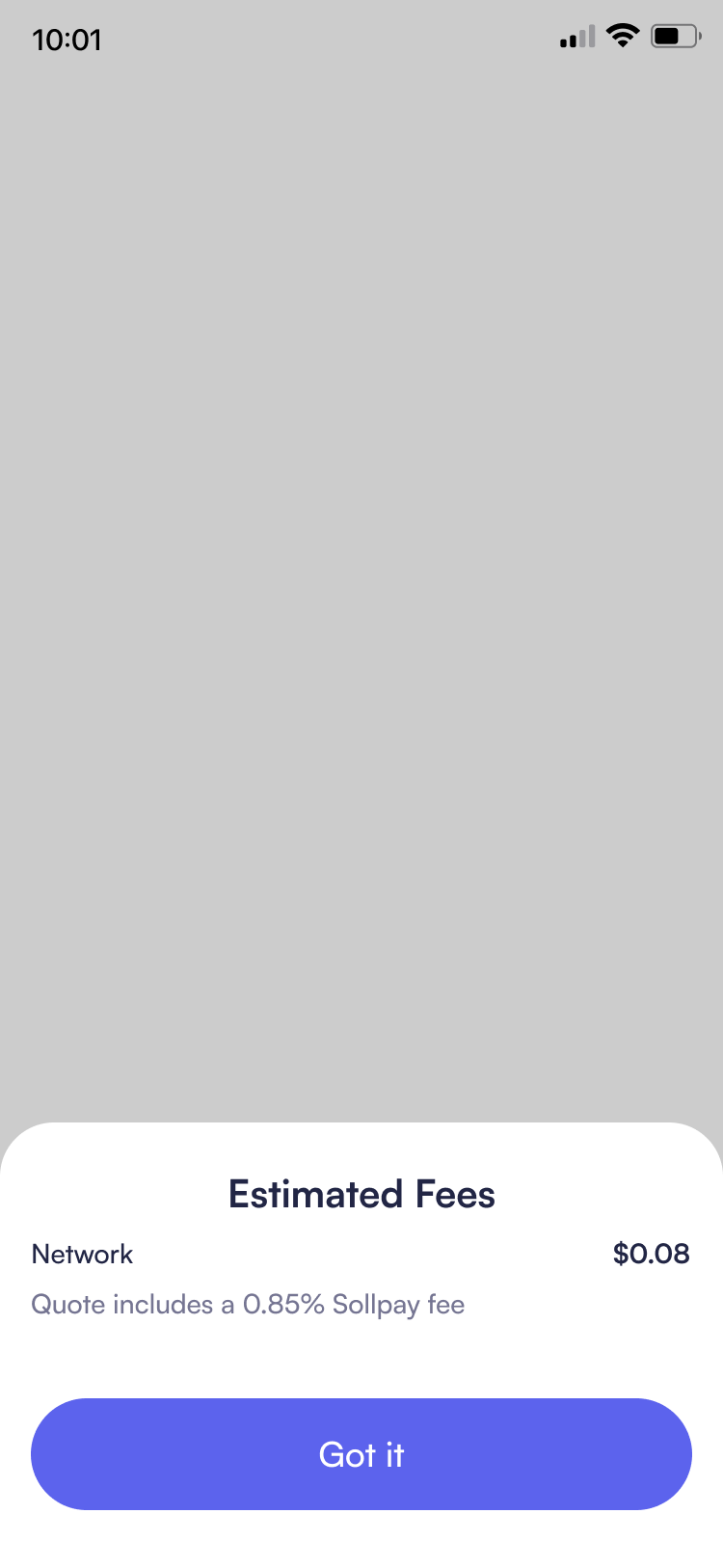
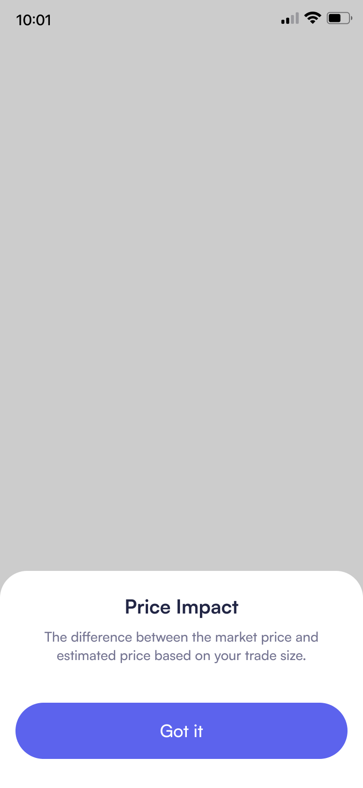
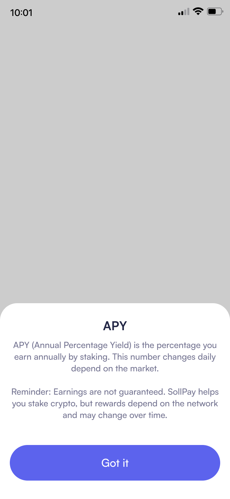
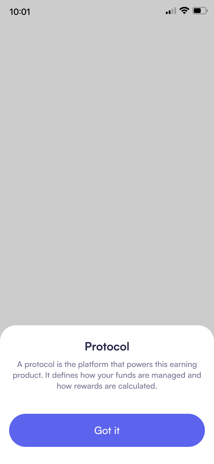
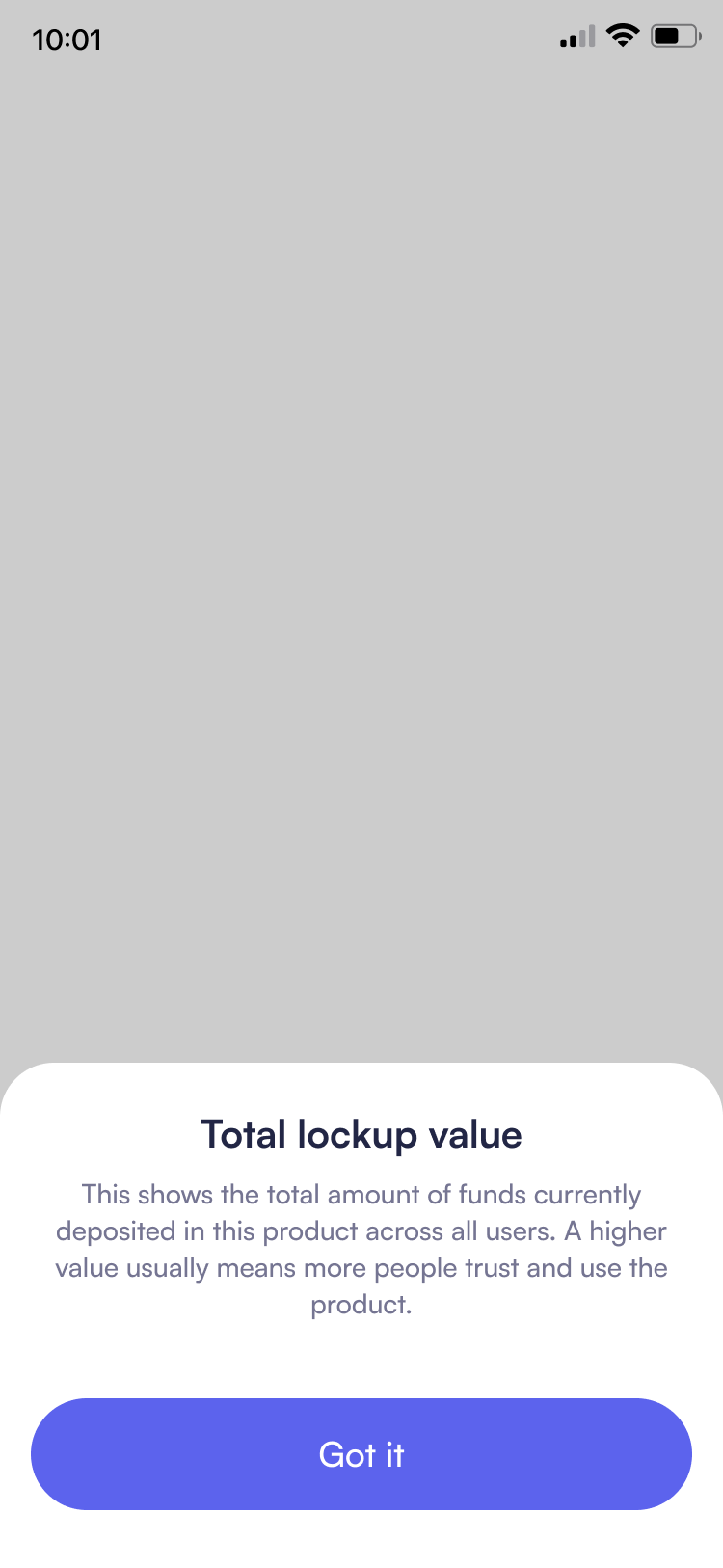
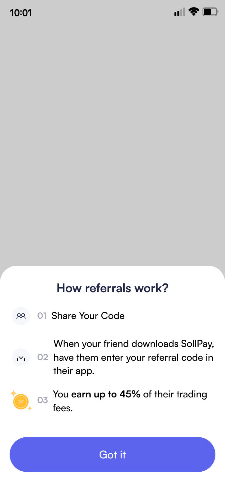
Technical terms are unavoidable in crypto, but they create significant barriers for beginners. Rather than overwhelming users with jargon upfront or assuming prior knowledge, I implemented contextual help tooltips throughout the app. This approach allows users to explore complexity at their own pace, learning terminology exactly when they encounter it and need it.

DESIGN SYSTEM & VISUAL IDENTITY
Building Brand Trust Through Design
1. Logo Development
The final logo is inspired by the letter S from "SollPay", combined with the motion of sending and receiving, represented by up and down arrows. These elements symbolize flow, connection and movement, just like how SollPay enables fast and secure crypto transfers.
2. Color System
The primary blue-violet (#5C63ED) is SollPay's brand color, used for key actions like primary buttons so it naturally draws attention. Secondary colors vibrant orange (#EC8B30) add warmth and personality to bring a playful and human touch. Text uses (#222645) instead of pure black for softer, more comfortable reading. All colors meet WCAG contrast standards, keeping the interface clear and reassuring, even in moments like sending crypto. The color system adapts for dark mode with adjusted values that maintain brand consistency while optimizing for low-light viewing.
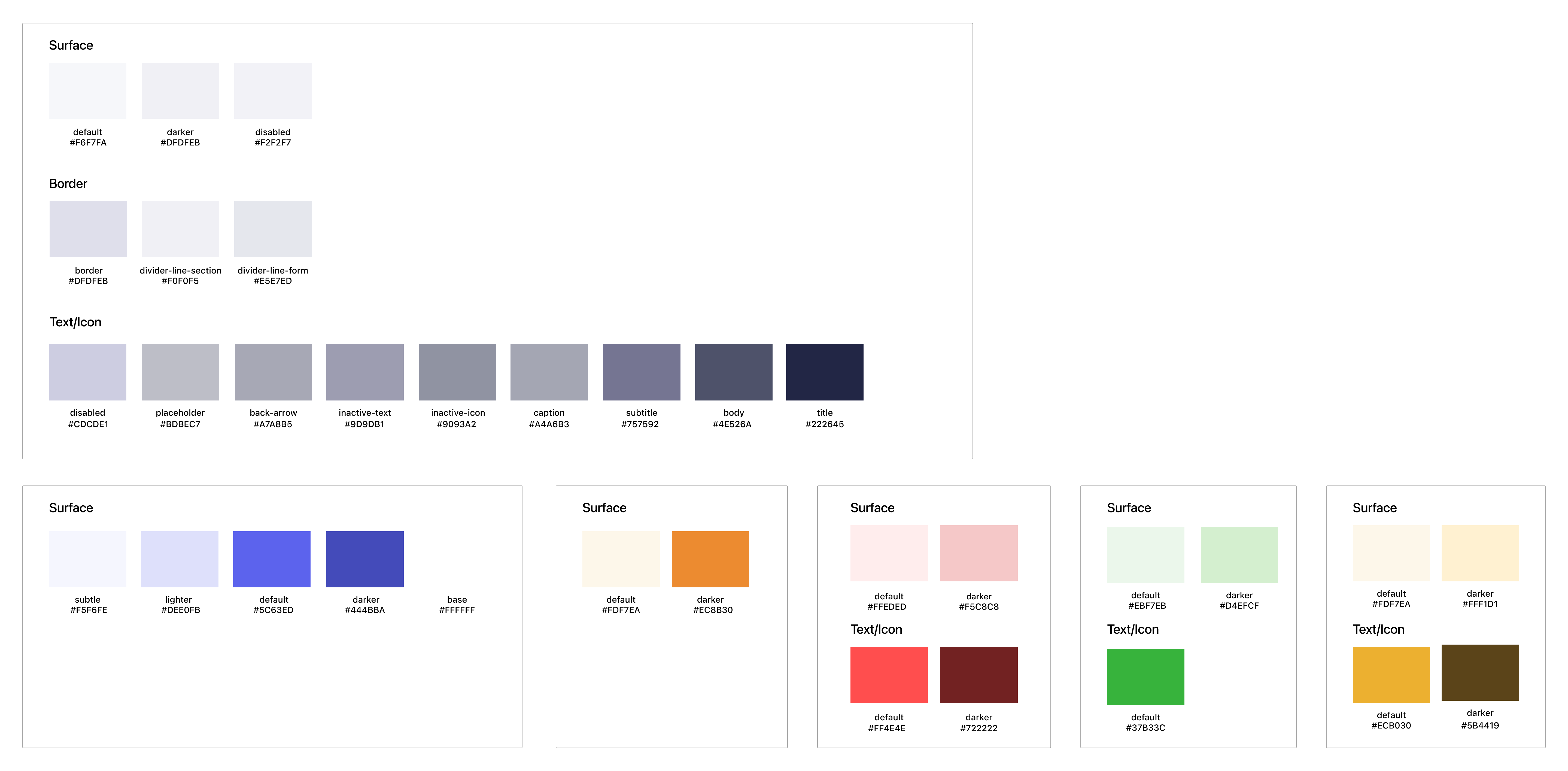
Light Mode Color Palette
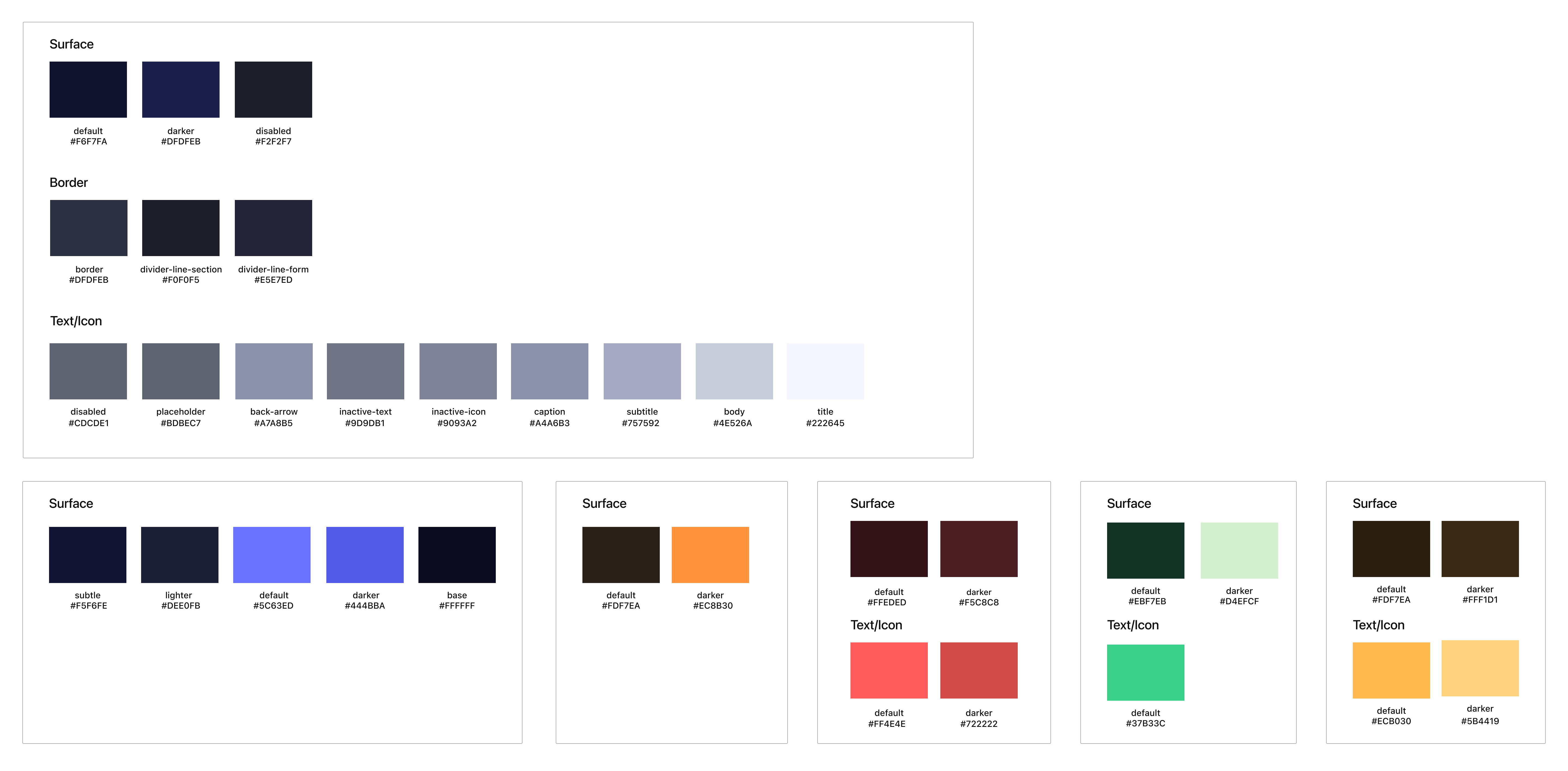
Dark Mode Color Palette
3. Typography
Satoshi font balances geometric clarity with human warmth, reducing the formality typical of financial apps.
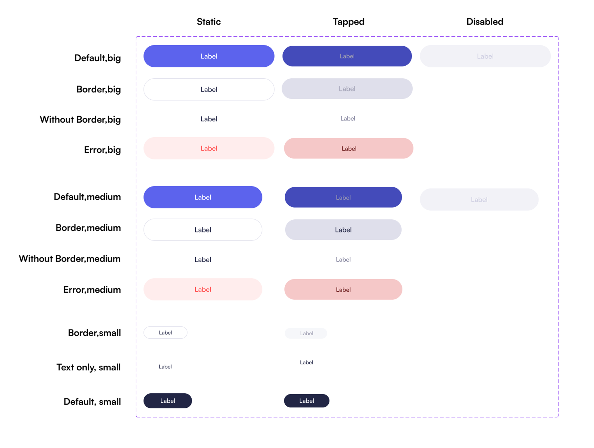
4. Button
I kept shapes simple and sizes generous so they're easy to tap, with clear visual states for press. When a user taps, the button changes color and gives a small vibration. This tactile feedback creates a sense of confirmation, reducing hesitation and reinforcing confidence.
Results
01. Design Validation & Iteration
Throughout the project, we took an iterative approach—I developed design solutions based on user research while our team tested with real users, and I refined the designs based on their feedback. To validate our design direction, our team conducted a soft launch with 11 participants:
The results were encouraging:
• 91% positive experience rating
• 82% felt safe using the app
• Features That Stood Out
However, the key feedback revealed an important insight:
"The app performs well at baseline level, but isn't wow-ed yet - it feels functional, not differentiated."
This validated that our core design decisions were working, users felt safe and found the app easy to use but we needed to push further on creating a distinctive, welcoming experience. We continued iterating on visual identity, micro-interactions, and educational elements to transform the app from functional to genuinely approachable.
02. Business Impact
Following our soft launch and subsequent iterations based on user feedback, we achieved remarkable traction:
• Achieve 1000 users within 1.5 month
18.5x growth in 7 weeks demonstrated that simplifying crypto's complexity successfully lowered barriers to entry and expanded market reach.
03. Design Impact
Simplest is the best way to build trust. This project proved that crypto apps don't need to feel like crypto apps. By applying familiar financial patterns, simplified language, clear visual hierarchy, and progressive disclosure, we made crypto accessible to beginners while maintaining functionality for experienced users leading to the rapid growth shown above.
REFLECTION
What I Learned
Starting this project knowing nothing about crypto turned out to be my superpower. Every time I got confused by some term, I realized...Oh! Beginners will hate this too. That confusion became my guide.
My biggest takeaway after looking at dozens of Web3 wallets: good crypto apps shouldn't feel like crypto apps. They should feel like the banking apps people already use and trust. All that blockchain complexity? Keep it in the background. Users just want to send, receive, swap, and stake their money.
Building from absolute zero was intense (and amazing). Creating SollPay from scratch taught me how to make crypto easy to understand, hide complexity without dumbing things down, and work with developers to know what we can realistically build.
Huge shoutout to Tom and Kyle, our UI/UX consultants. They taught me how to actually think like a user and kept pushing me to make things simpler, understandable and more human.
This whole 0-to-1 journey? Honestly honored I got to be part of it.
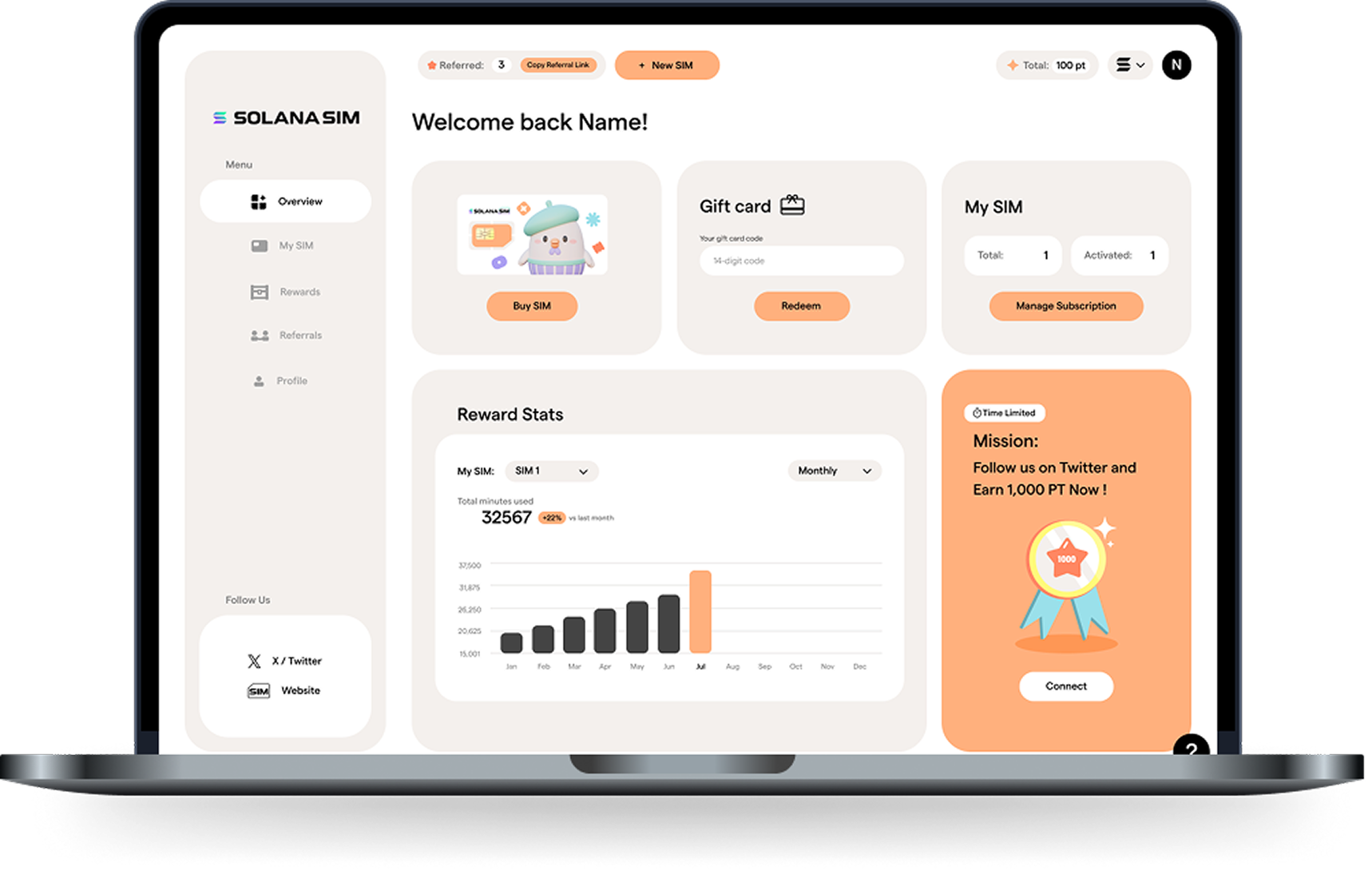
Next project:
Solana SIM
Reimagining eSIMs as a game