SOLANA SIM | BRAND & UI DESIGN

Developing character-driven brand identity and designing the dashboard for an eSIM service

Solana SIM Level 1 Solana SIM Level 2 Solana SIM Level 3

Project Brief

Solana SIM is an eSIM service offering global mobile data coverage with cryptocurrency payment options. The existing brand lacked visual distinction in a crowded market dominated by similar corporate aesthetics.

I was given one month to develop a character-driven brand identity and design the dashboard interface.

My Role

UI Designer - Visual Design, Motion Design, Prototyping

Team

Jonathan He - PM
Hui Qi Zheng - CTO
Zehao Wu - SWE

Timeline

Paris, Malaysia, China
(Oct 2024 - Dec 2024)

Tools

Figma, Adobe Illustrator, Lottielabs

The Problem

Generic eSIM services lack distinctive brand identity

Most eSIM services, including the original Solana SIM, follow similar visual patterns, making it difficult to stand out in the market.

I was tasked with developing Chickie as a brand mascot and creating a complete character-driven brand identity to differentiate Solana SIM.

Competitor 1 Competitor 2 Competitor 3 Competitor 4
Competitor 5 Competitor 6 Competitor 7 Competitor 8

eSIM service comparisons showing similar aesthetics

The Solution

Building a Character-Driven Brand Identity

I designed Chickie's character and established a complete visual identity with warm colors and playful elements to create memorable brand recognition and differentiate Solana SIM in a crowded market.

Chickie Mascot

Solana Sim's Mascot

01

Visual Style Transformation

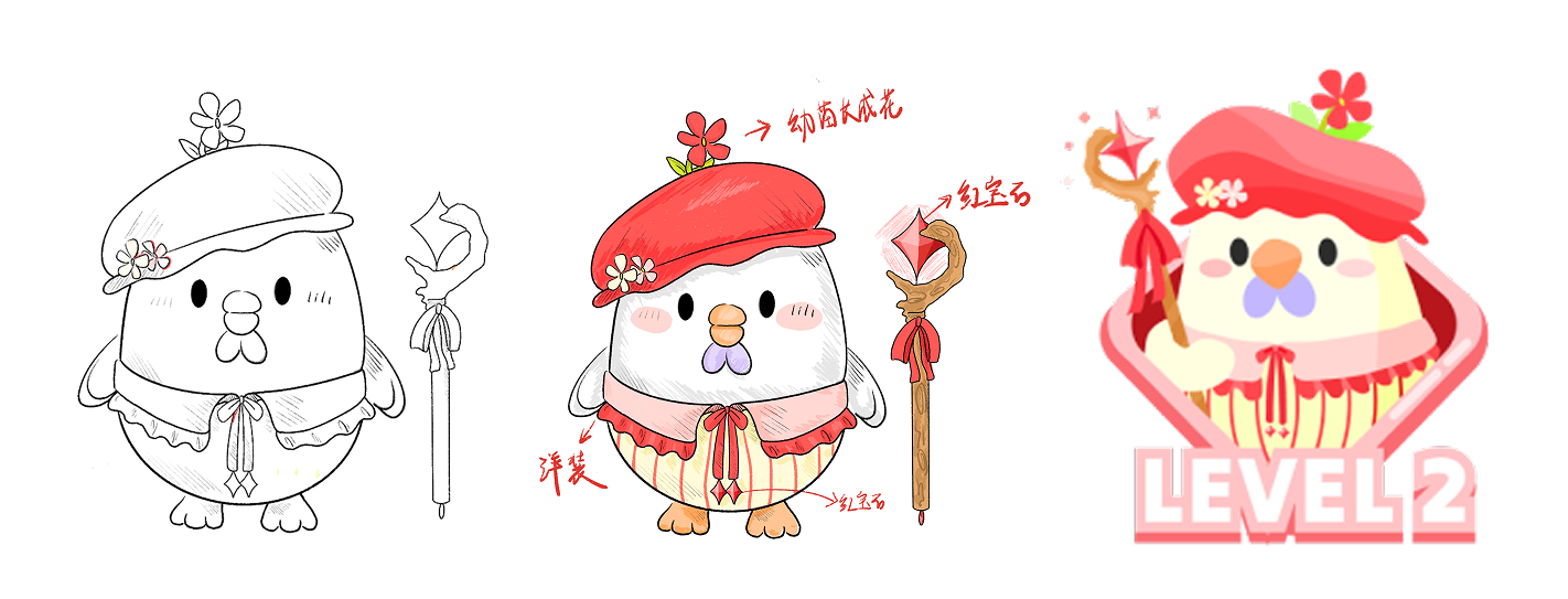
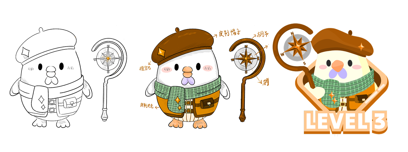
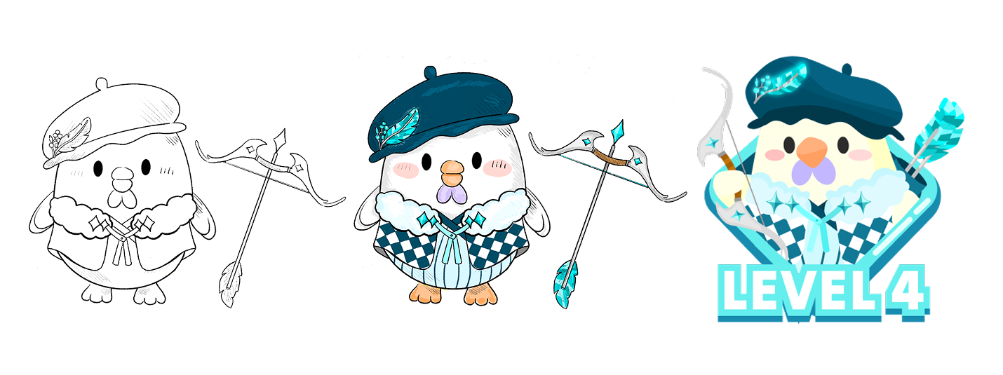
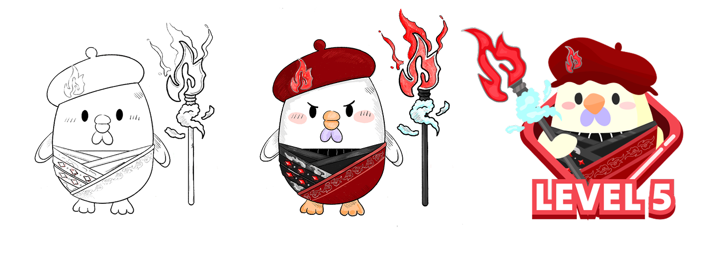
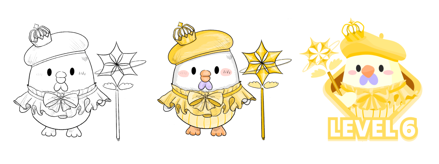
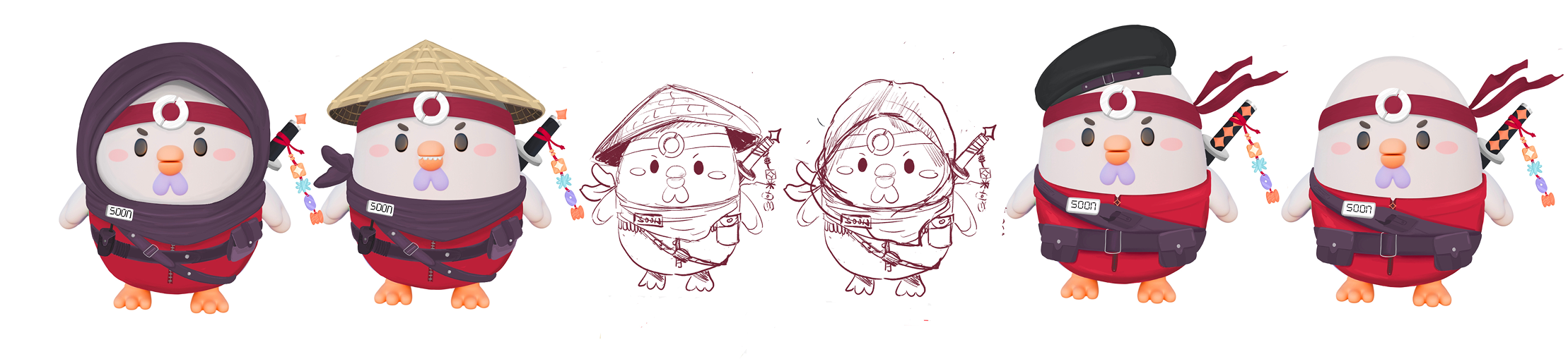
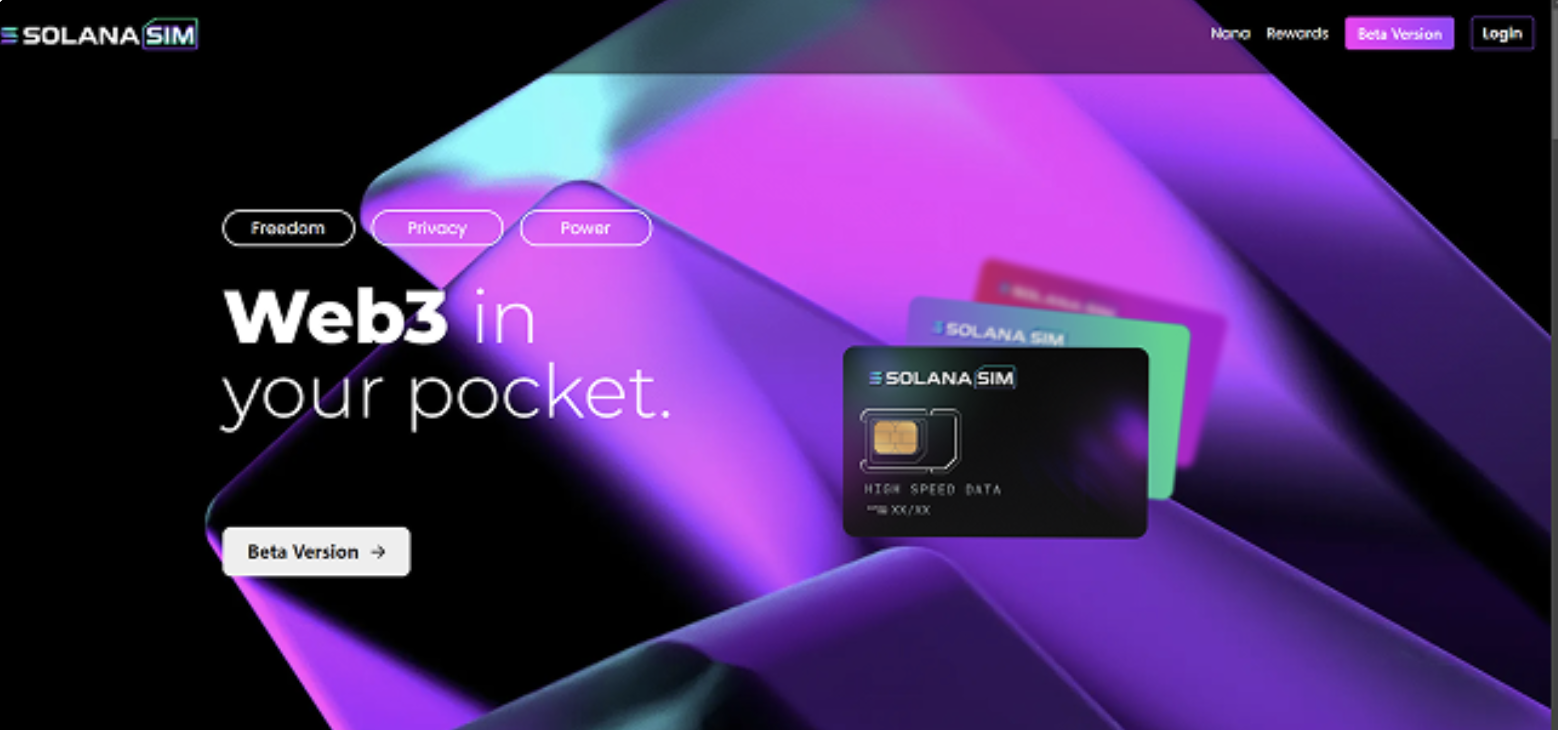
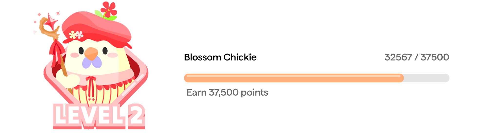
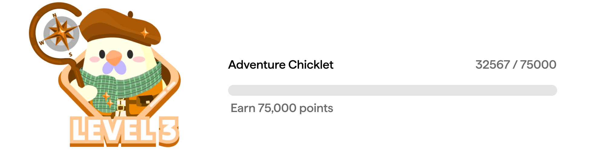
I developed a new visual style with warm colors and friendly animations to differentiate from typical eSIM aesthetics and support the character-driven brand direction. The redesigned website showcases this new visual direction:

02

Designing Chickie's Evolution Journey

I designed Chickie as the brand mascot to create emotional connection and brand memorability. To make the character more engaging, I created six evolution stages (Level 1-6) tied to user milestones, from Baby Sprout Chickie to Chicky Royale.

Baby Sprout Chickie Level 1 Blossom Chickie Level 2 Adventure Chickie Level 3 Frosty Guard Chickie Level 4 Flame Warrior Chickie Level 5 Chicky Royale Level 6
03

Defining Visual Identity

With Chickie as the brand mascot established, I needed to build a complete visual system that would support the character-driven approach while maintaining usability. The design needed to feel approachable and friendly without sacrificing clarity for essential tasks like managing data and purchases.

Color Palette


I selected soft creams and peach tones to create a warm, welcoming atmosphere, moving away from the cold aesthetic of typical eSIM providers.

Typography


Matter font balances geometric structure with approachable curves - providing clarity for information display while maintaining the friendly tone of the brand.

Matter

Iconography


Rounded icons reinforce the friendly, approachable aesthetic throughout the interface.

Solana SIM Icon Set
04

Enhancing Brand Communication

I designed playful animations to explain Web3 concepts featured on the website, making them more approachable through visual metaphors instead of technical jargon.

DePIN Universe

Floating app icons showing seamless access to decentralized applications.

Unique Digital Identity

Geometric symbols visualizing unique Web3 identity.

Secure Identity Management

Chickie scan visualization showing authentication and security.

Blockchain Security

Shield icons moving along a conveyor, emphasizing secure transactions.

05

Designing the Dashboard

I redesigned the dashboard to help users manage multiple eSIMs across devices and regions. The design uses a card-based layout to organize information clearly, with custom illustrations integrated throughout to maintain the friendly brand personality. Status indicators, data visualization, and quick actions are positioned for easy scanning and access.

Personal Reflection

This was my first big project, and honestly? One month felt impossible at first.


What happened: The project ended up getting postponed and then pivoted to something else (SollPay). So I don't have any launch data or user feedback to show how it actually performed.


What I enjoyed: Exploring Chickie's versatility was really fun - collaborating with other brands and giving the character different looks. From samurai to quirky hats, every version showed a new side while keeping the core charm intact.

Chickie Character Variations

What I'd change: Looking back, I wish I'd been involved before the mascot decision was made. I would've pushed for user research - actually talking to the target users to see if character-driven branding resonates with them. Testing assumptions early would've given us more confidence in the direction.


The project might not have launched, but it taught me something valuable: always validate assumptions with real users before committing to a direction. It's a lesson that shapes how I approach design now.

Next project:

Yungrace AI

Bridging Cultures Through Design

Yungrace AI Preview